Velocitea was created to address a gap in the market that its owner identified: the absence of a tea beverage that could provide energy boosts similar to coffee and energy drinks. This led to the development of our iconic new beverage, which infuses tea with a unique blend of ingredients focused on delivering an energy boost to the consumer. Keep scrolling to learn more about our brand!
Can Labels
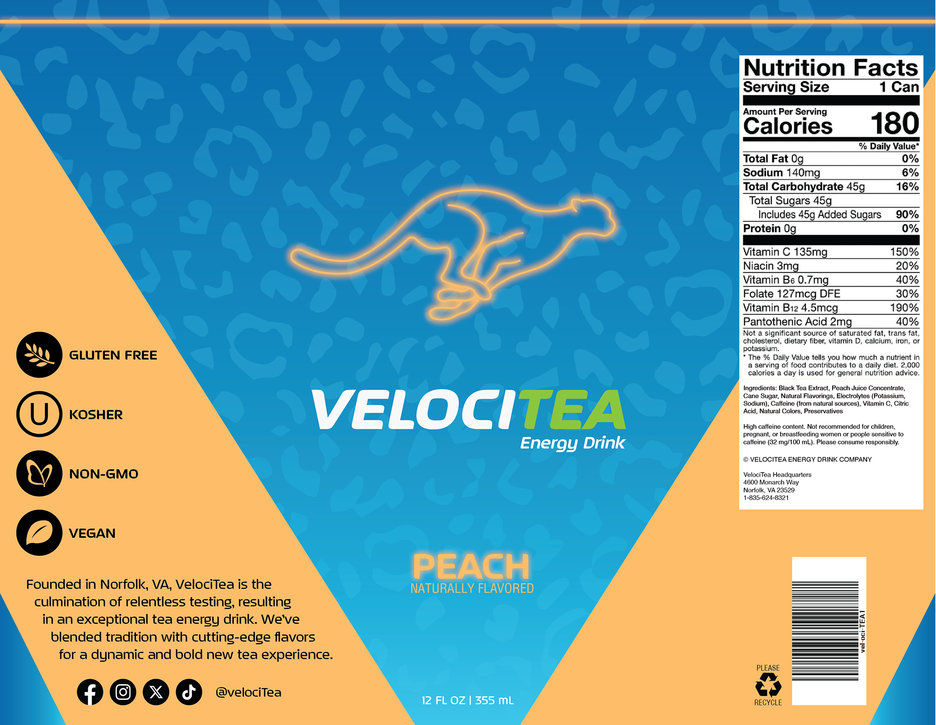
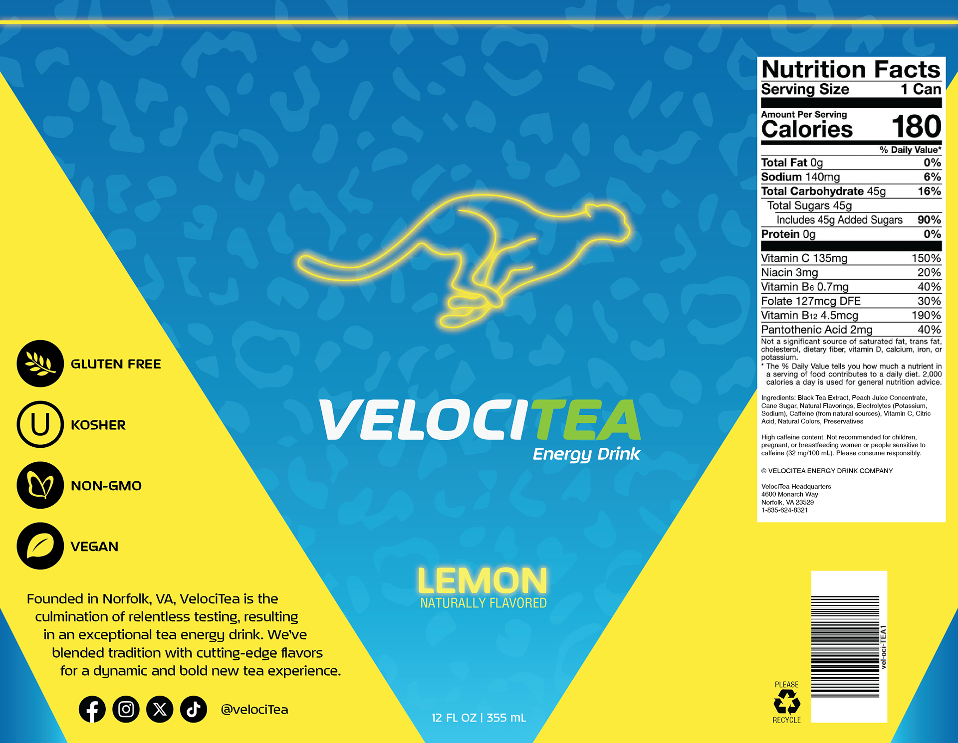
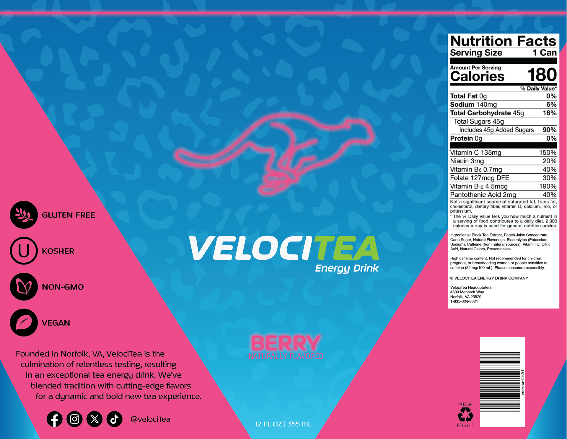
The initial step in designing the brand was to create the perfect label that resonated with our target market: young people who enjoy tea but also seek the energy boost associated with coffee or energy drinks. This involved crafting a logo that would appeal to this specific demographic. I chose the iconography of a cheetah running to underscore that the product provides a similar energy boost to the one produced by other beverages. This is further reflected in the cheetah pattern adorning the background of the can. To capture the youthful energy of the intended audience, I opted for a neon aesthetic in both the typography and logo, along with bright, eye-catching colors.

Peach Label

Lemon Label

Berry Label
Packaging
It was crucial to illustrate how the cans would appear when displayed in retail stores. This required maintaining the design standards established in the can labels. The cheetah patterning was utilized this time as a cohesive element to tie together all sides of the box. The primary focus of the box was on the cans themselves. It was important to emphasize them, as they would greatly influence consumers' decision to purchase.
Landing Page
The Home Page was designed to prominently feature any recent news related to the brand. For the initial launch, it was decided to highlight the brand's integration into big box retailers. From the main page, users can access every other page on the website, including the Products Page, About Us Page, and all support and social media links located at the bottom.
The Products Page at launch showcases our three classic flavors: Lemon, Peach, and Berry. Users can easily scroll through them, with each can acting as a clickable button to provide more detailed information. This is indicated by the glow effect becoming more prominent when a user hovers over it.
Upon clicking on the can, users will be directed to the expanded Products page. Here, they can find more insights into each drink including a short description, ingredients, and Nutrition Facts. Users can easily return to the main Products page by clicking on the can once again.
The About Us page narrates the story of the brand from its inception to creation. The page was designed to complement the story, with a photo of the founder holding the product serving as the banner to highlight the personal touch behind the brand.
Prototype


