Hello and Welcome to Donut Designs! We've got a cool new way for you to make and buy donuts. At our shop, you'll get the opportunity to create your own unique donuts using our special kiosk system. We've got lots of different fillings, icings, and toppings for you to choose from, so you can mix and match to make your perfect donut combo. Our kiosk is made to be super easy to use and fits right in with our goal of always coming up with new and tasty donut ideas. Come join us in making donut magic!

Home Screen
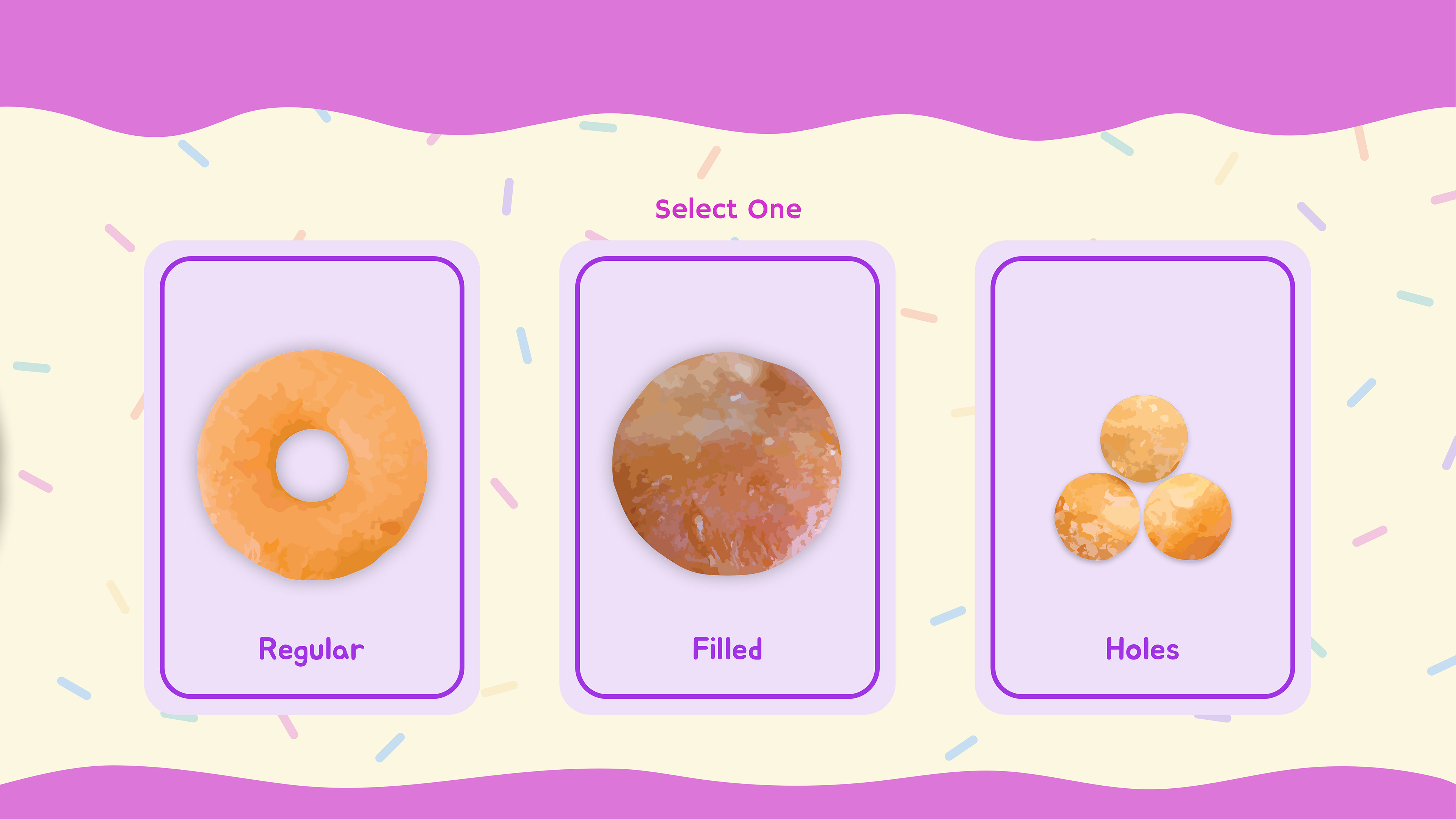
Donut Type Selection
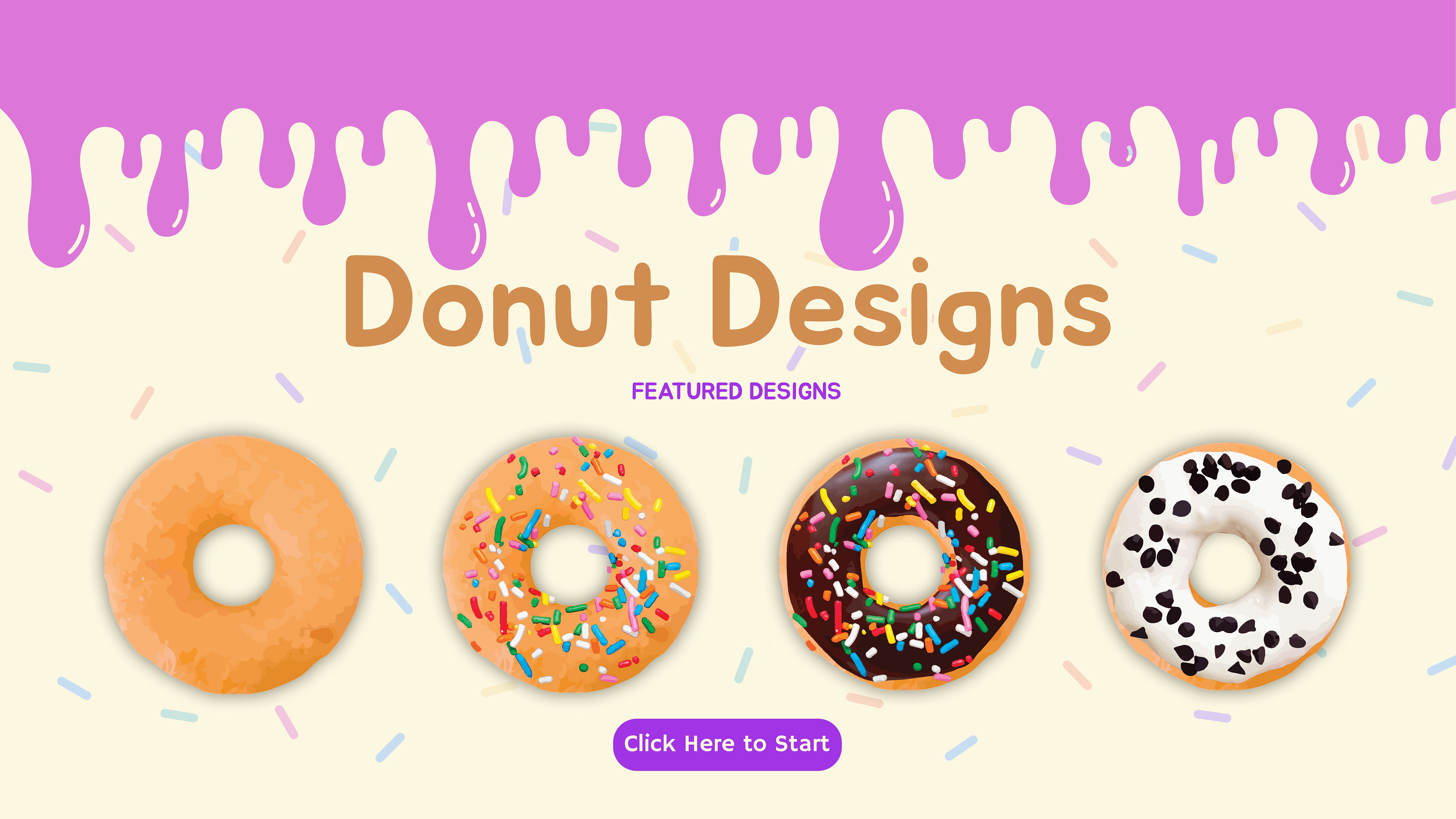
The Home Screen was designed to highlight a lineup of four donuts, each displaying creations from past users. These would rotate daily, showcasing fresh and unique combinations. Pressing the Start button triggers an animation where the header drips down, forming the footer for the Donut Type Selection screen.
On the Donut Type Selection screen, you'll find three choices offered by the shop: Regular, Filled, and Donut Holes. Opting for any of these delectable categories will seamlessly guide the user to the next step—the Icing Selection screen.
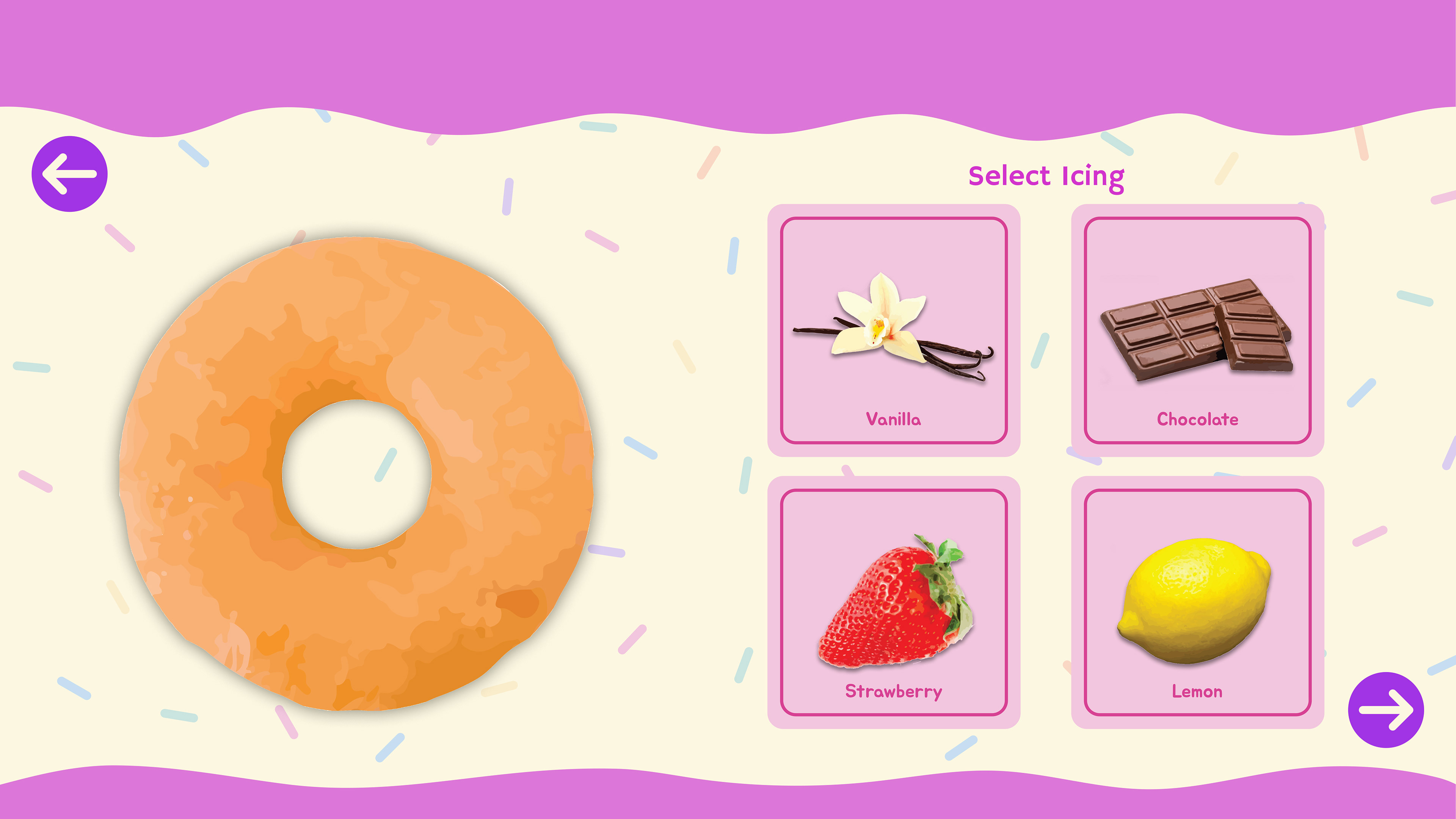
Icing Selection
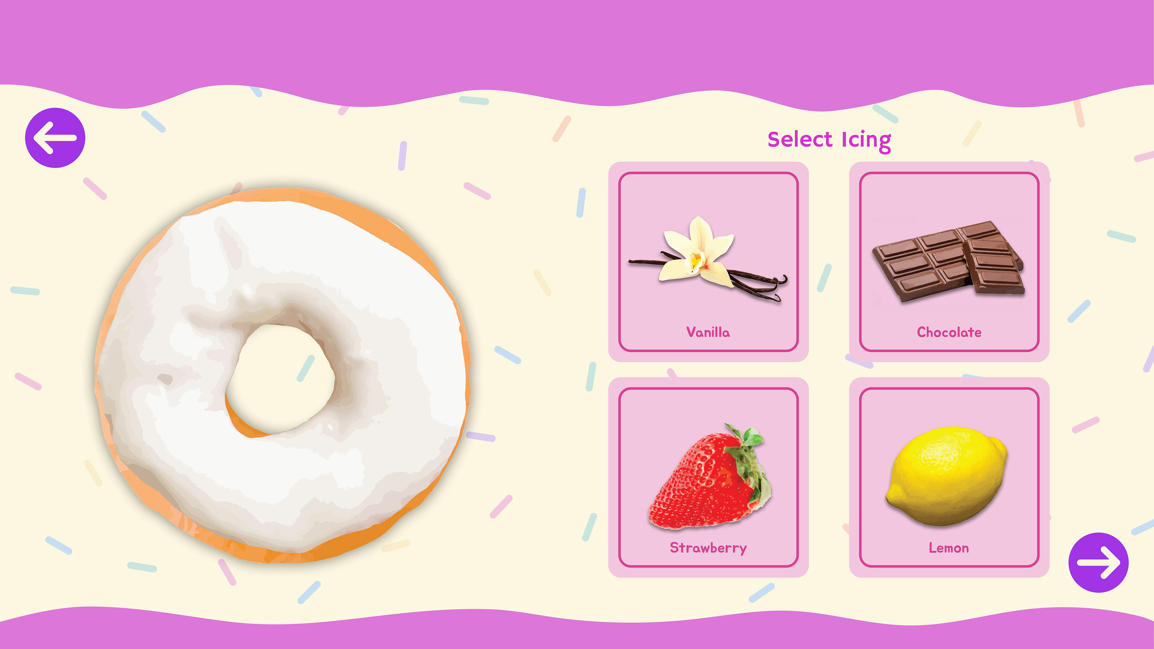
Vanilla Icing Selection

Chocolate Icing Selection
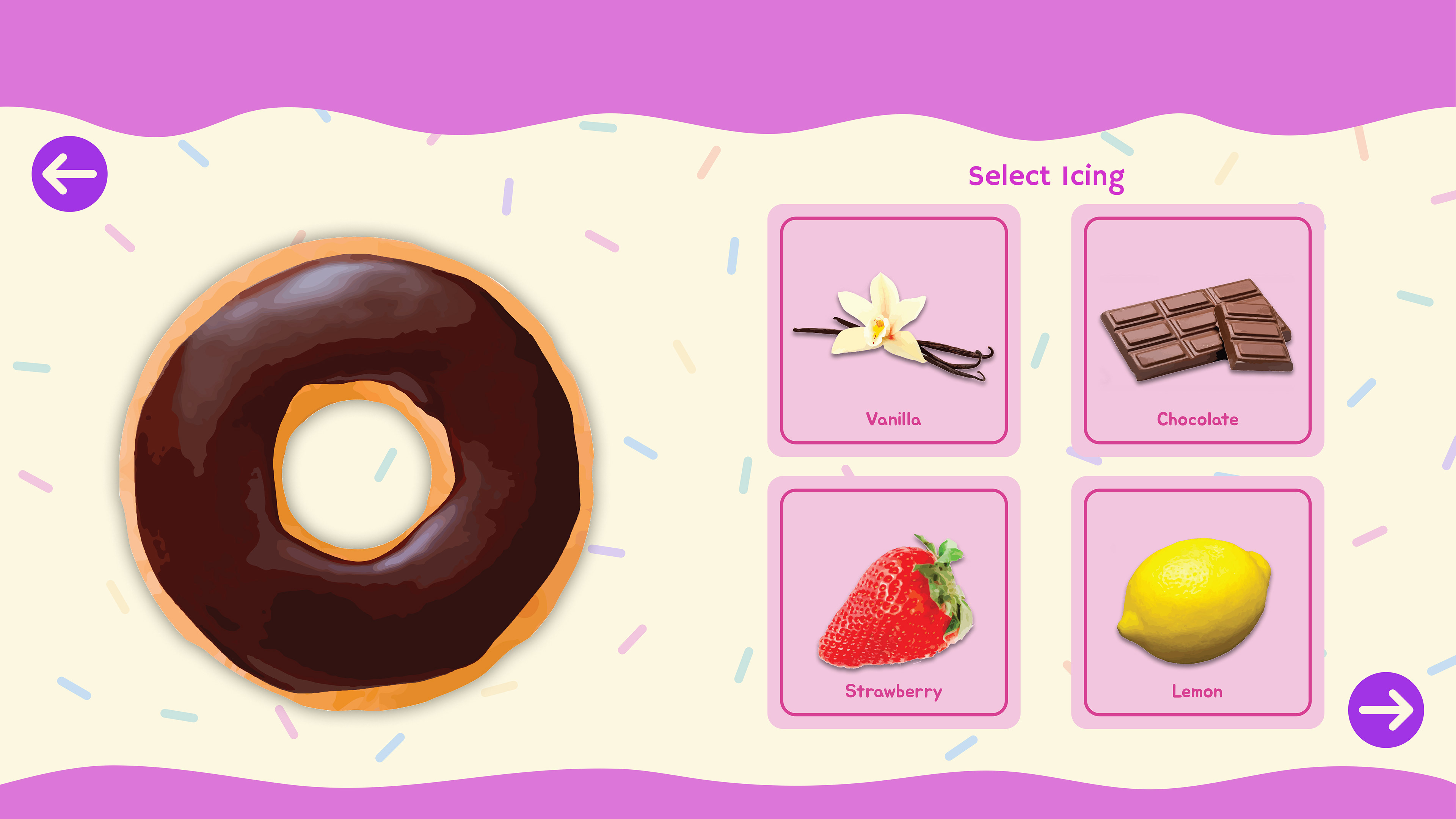
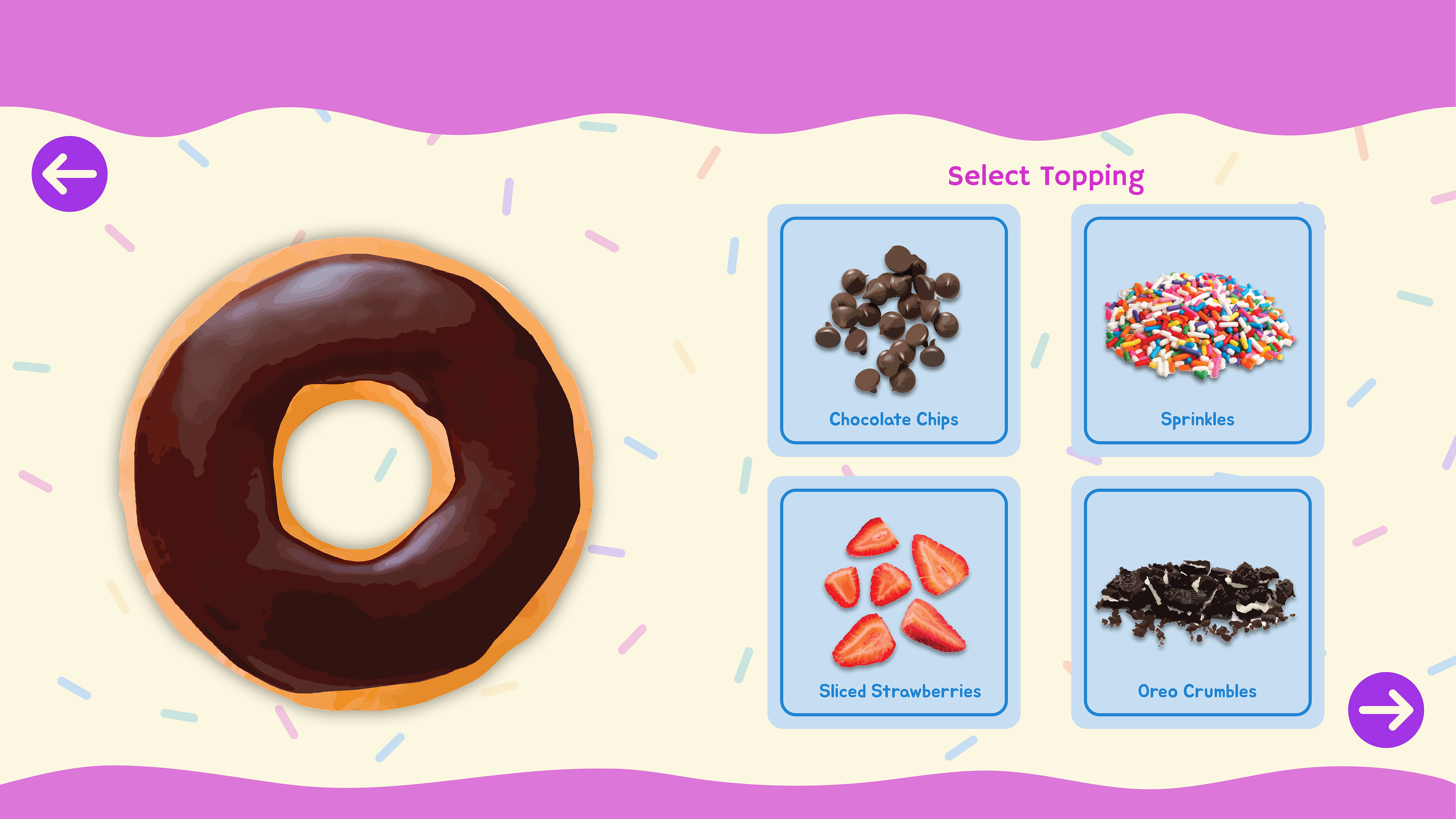
The Icing Selection Screen features a variety of flavors for users to choose from, with monthly rotations to mix things up. The current flavors are the classic staples. Clicking on any of the flavor buttons will display the chosen icing flavor on the user's donut.
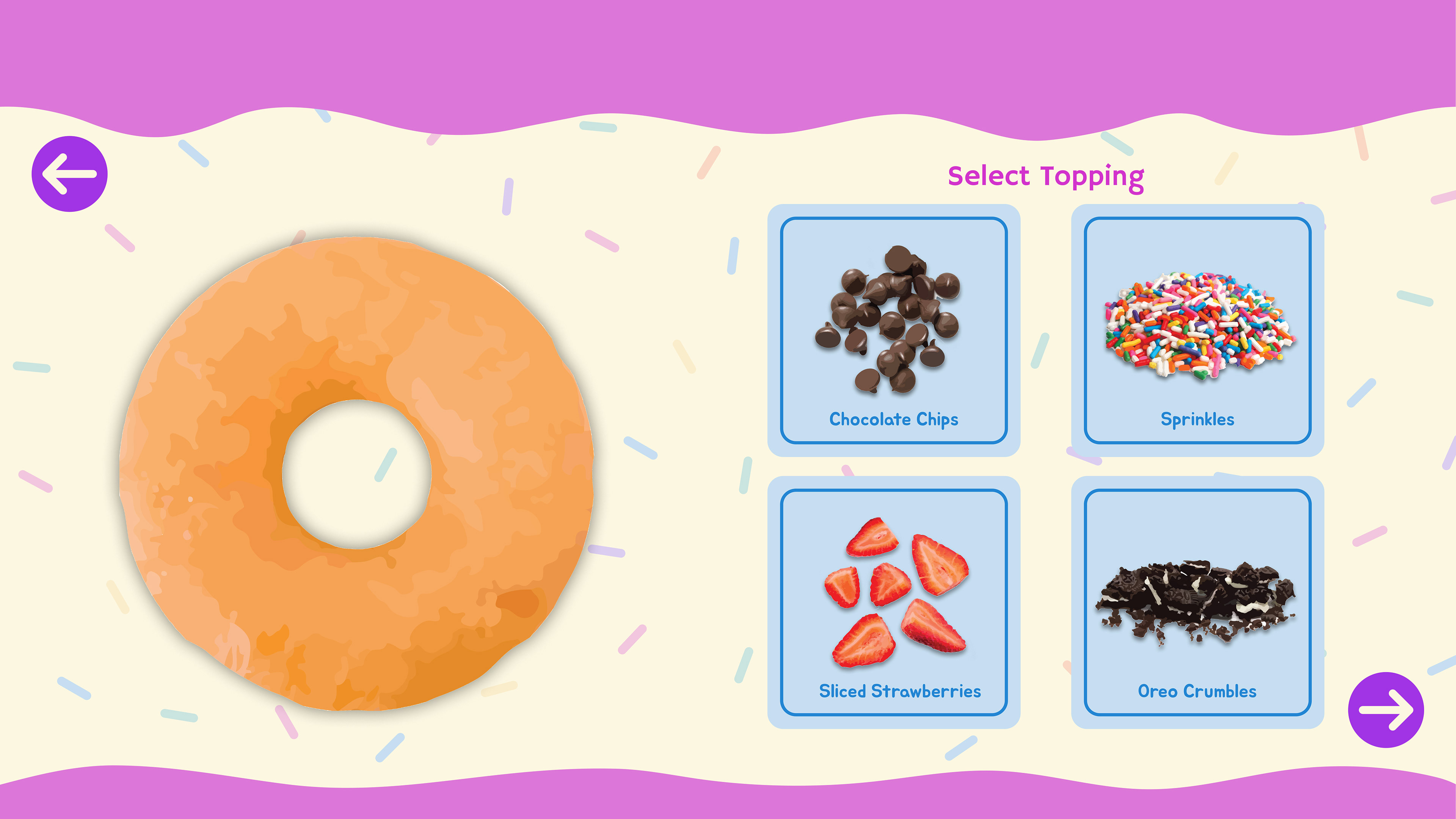
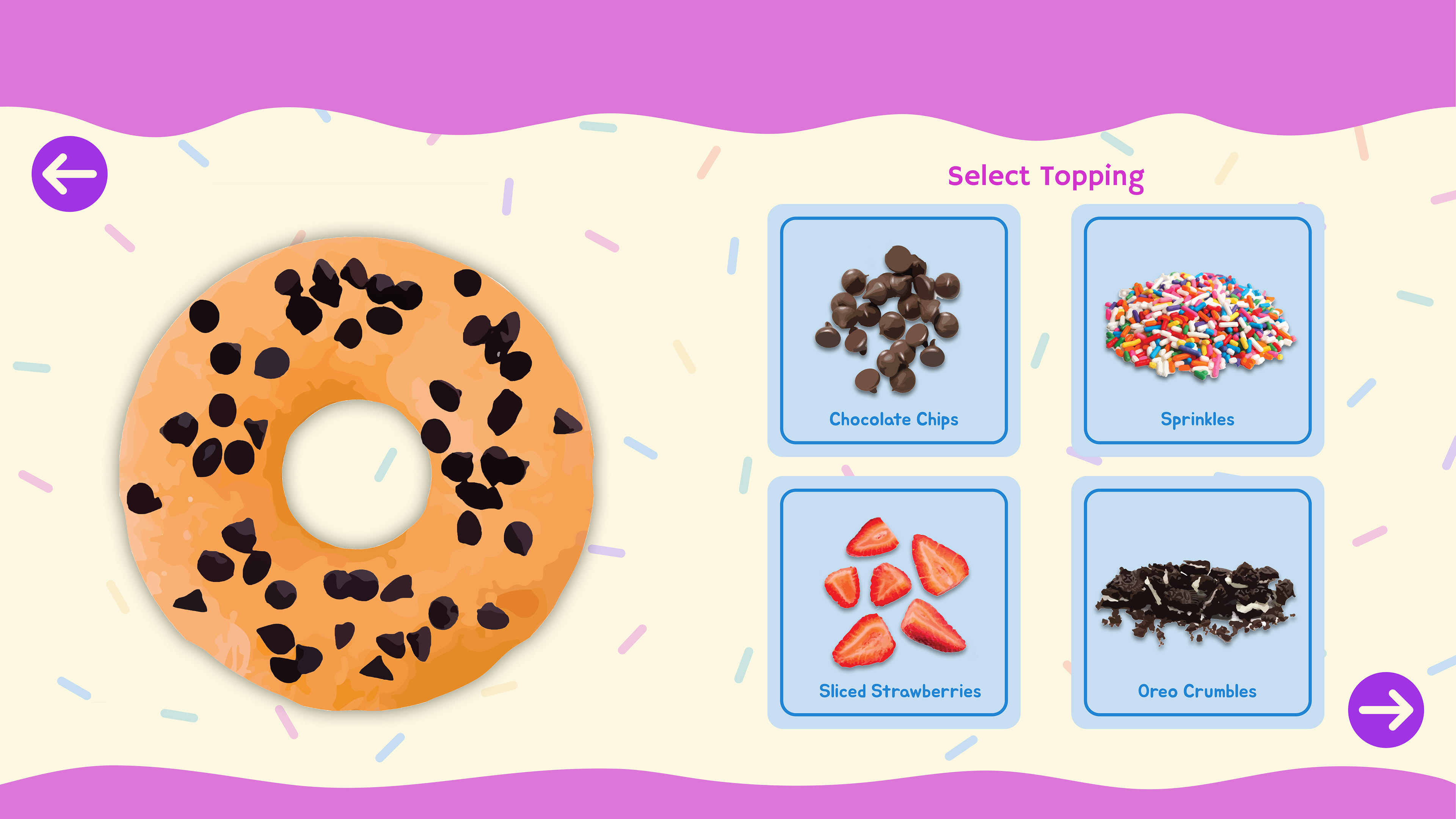
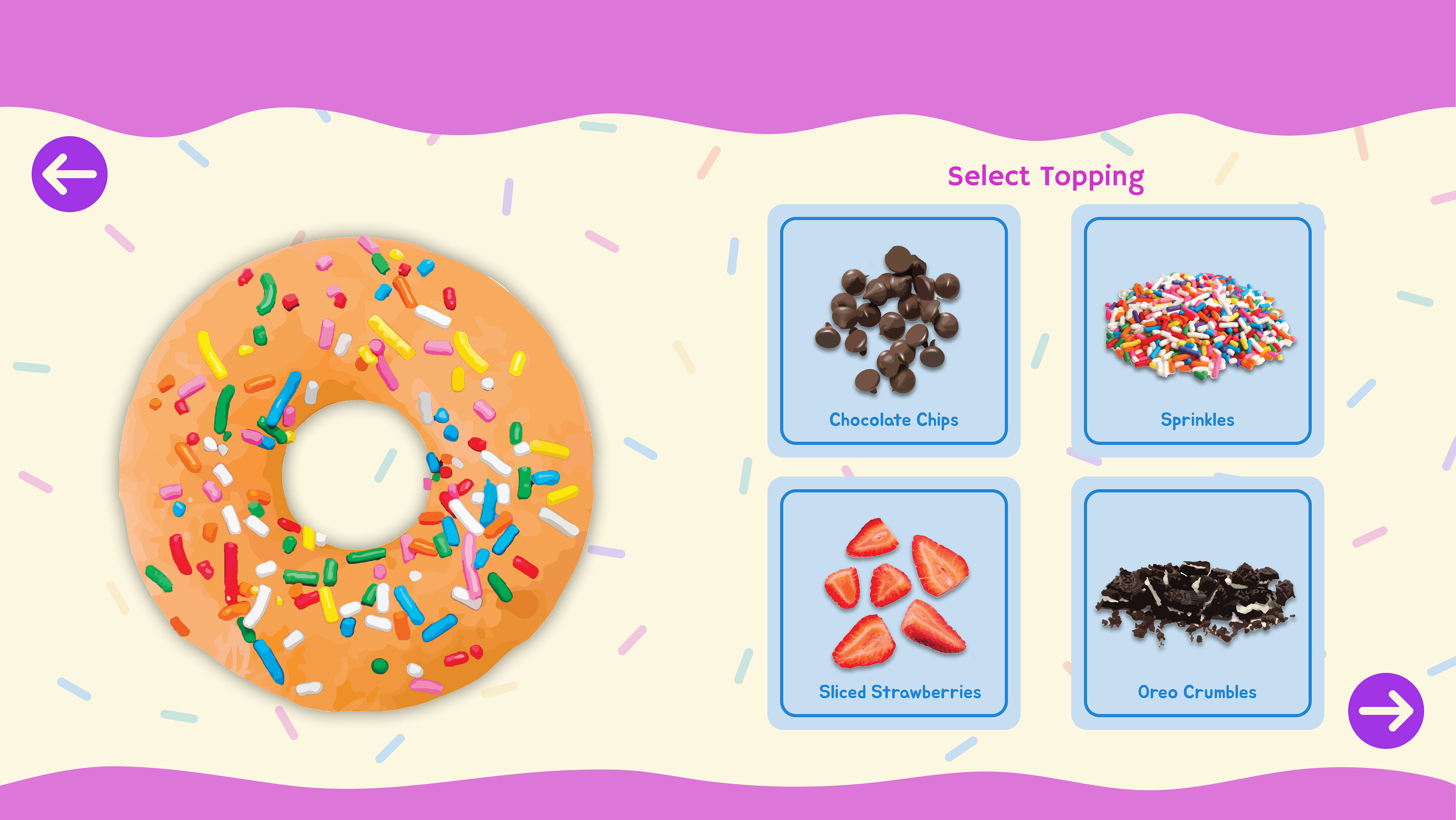
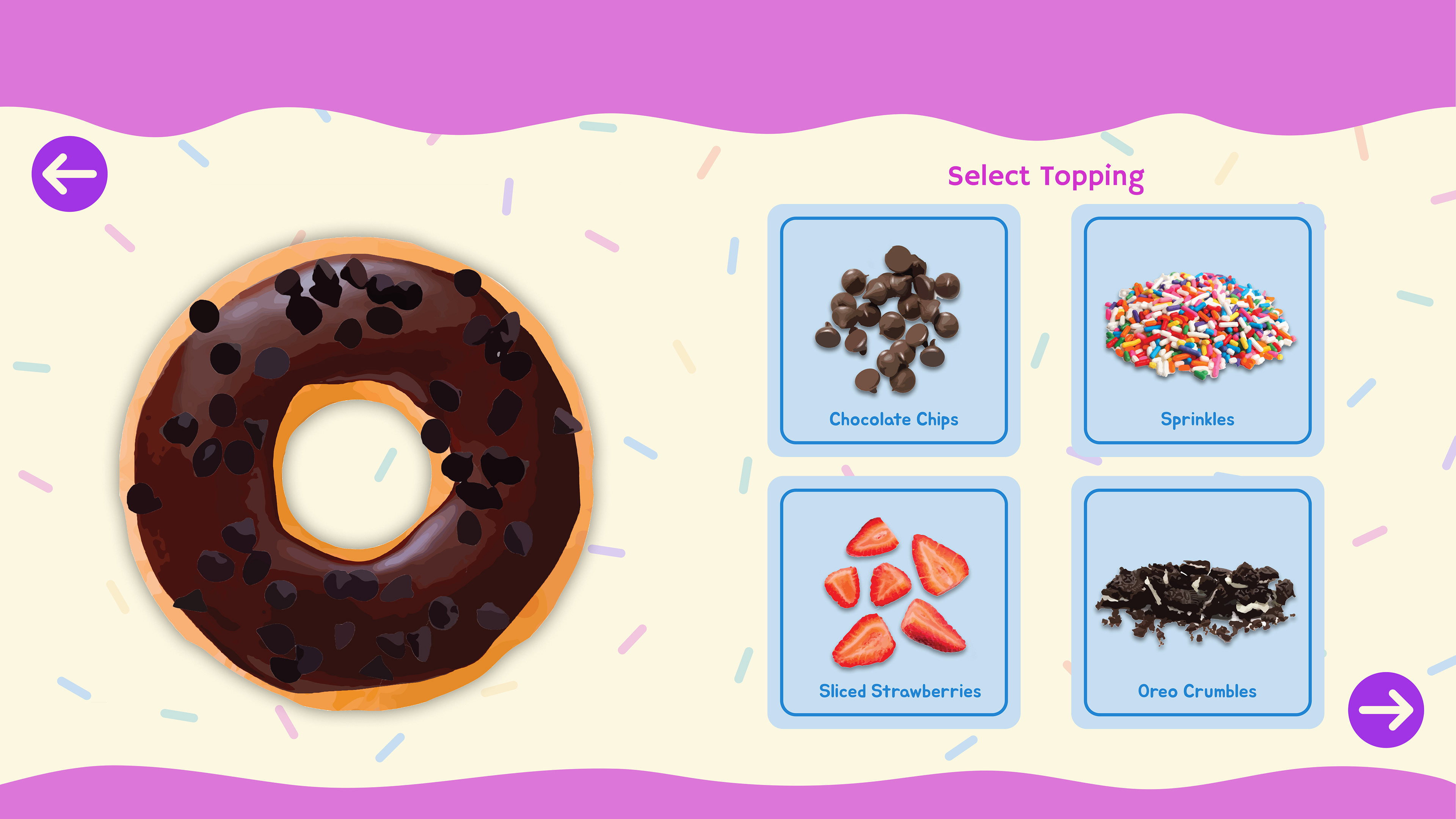
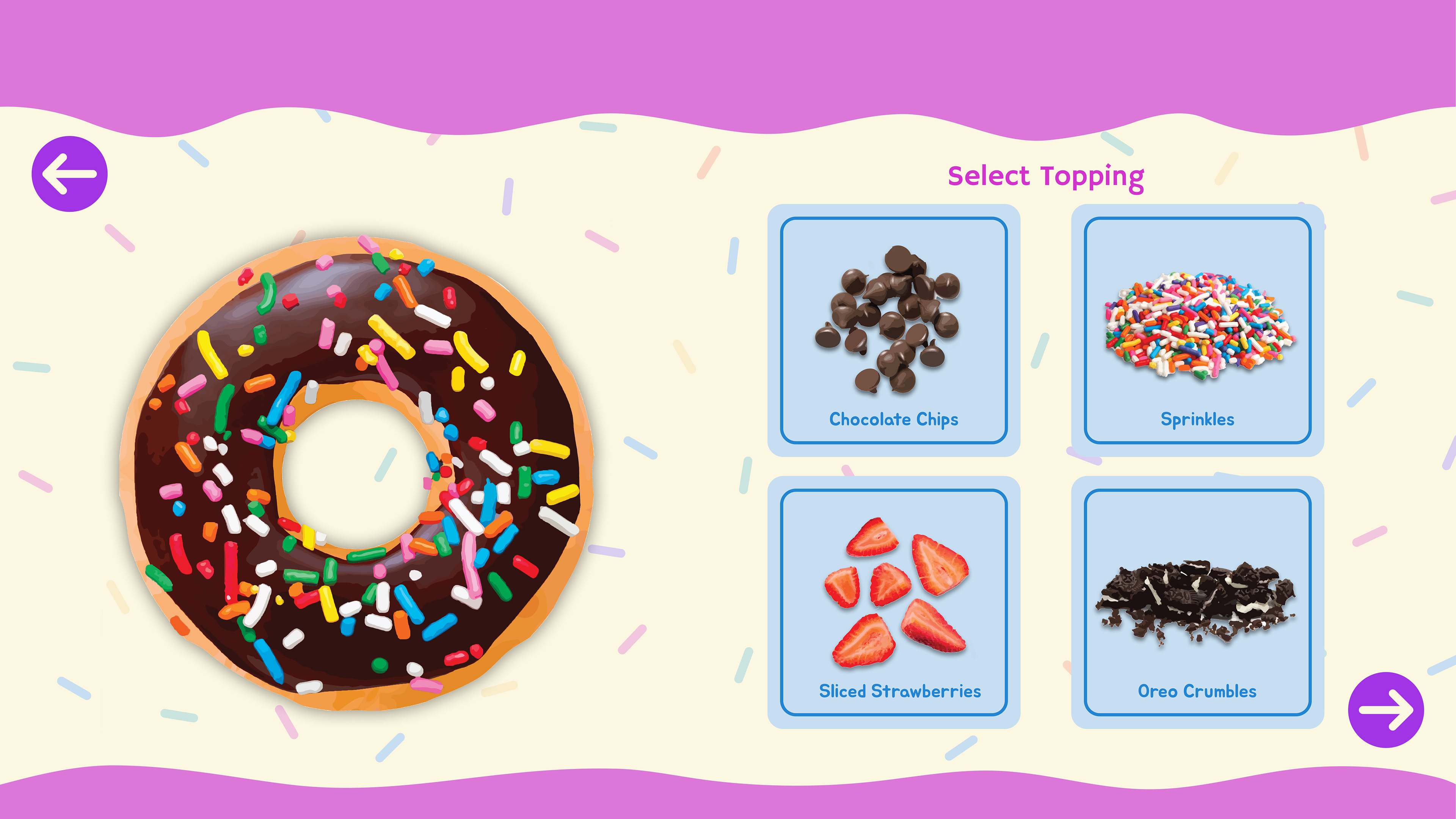
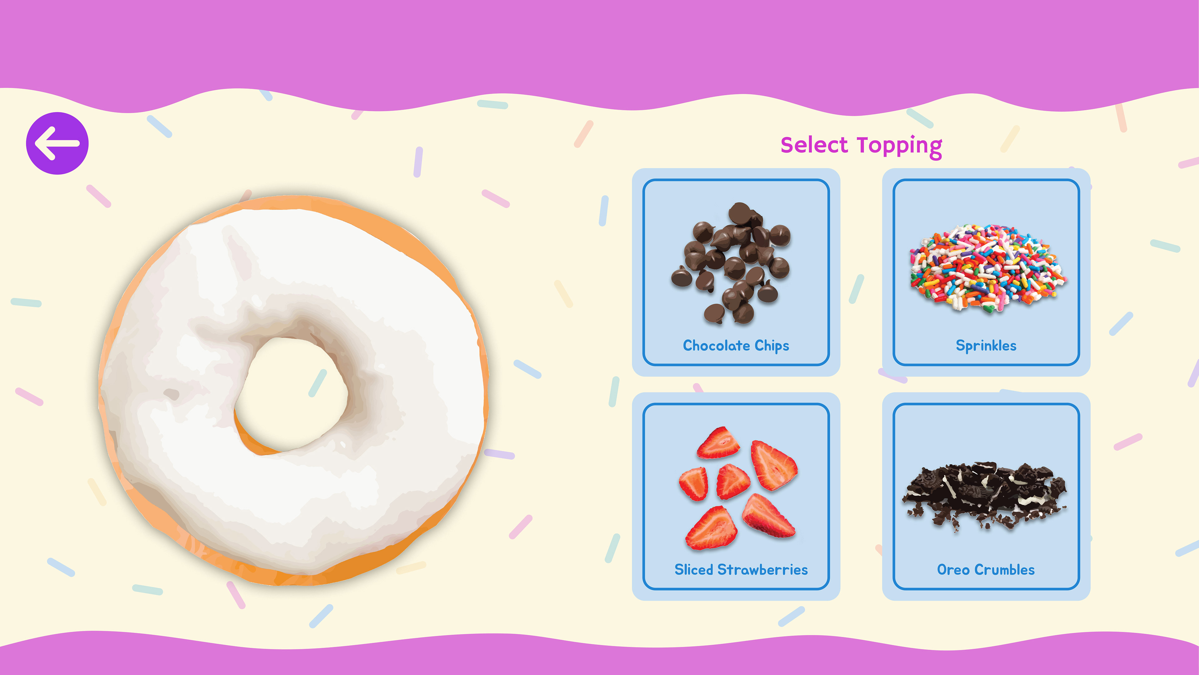
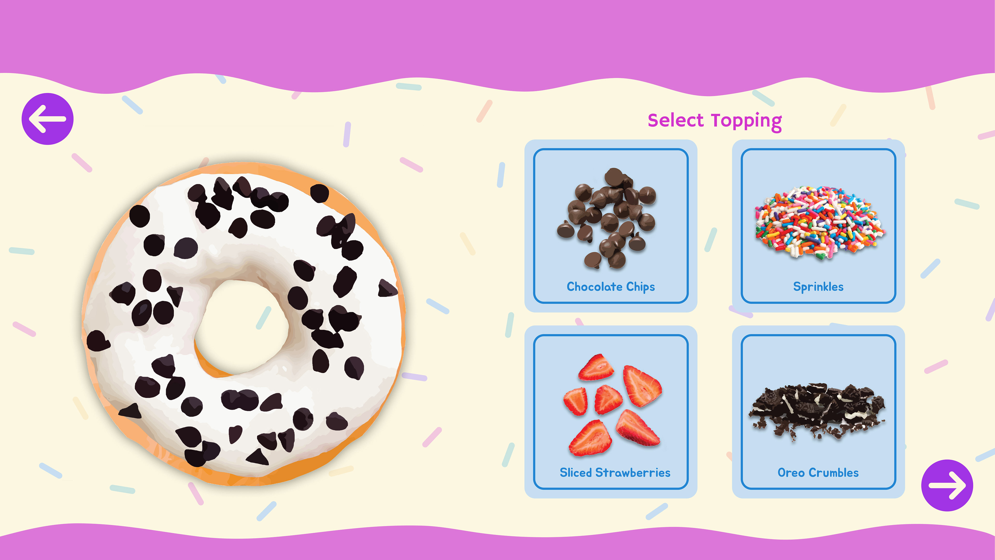
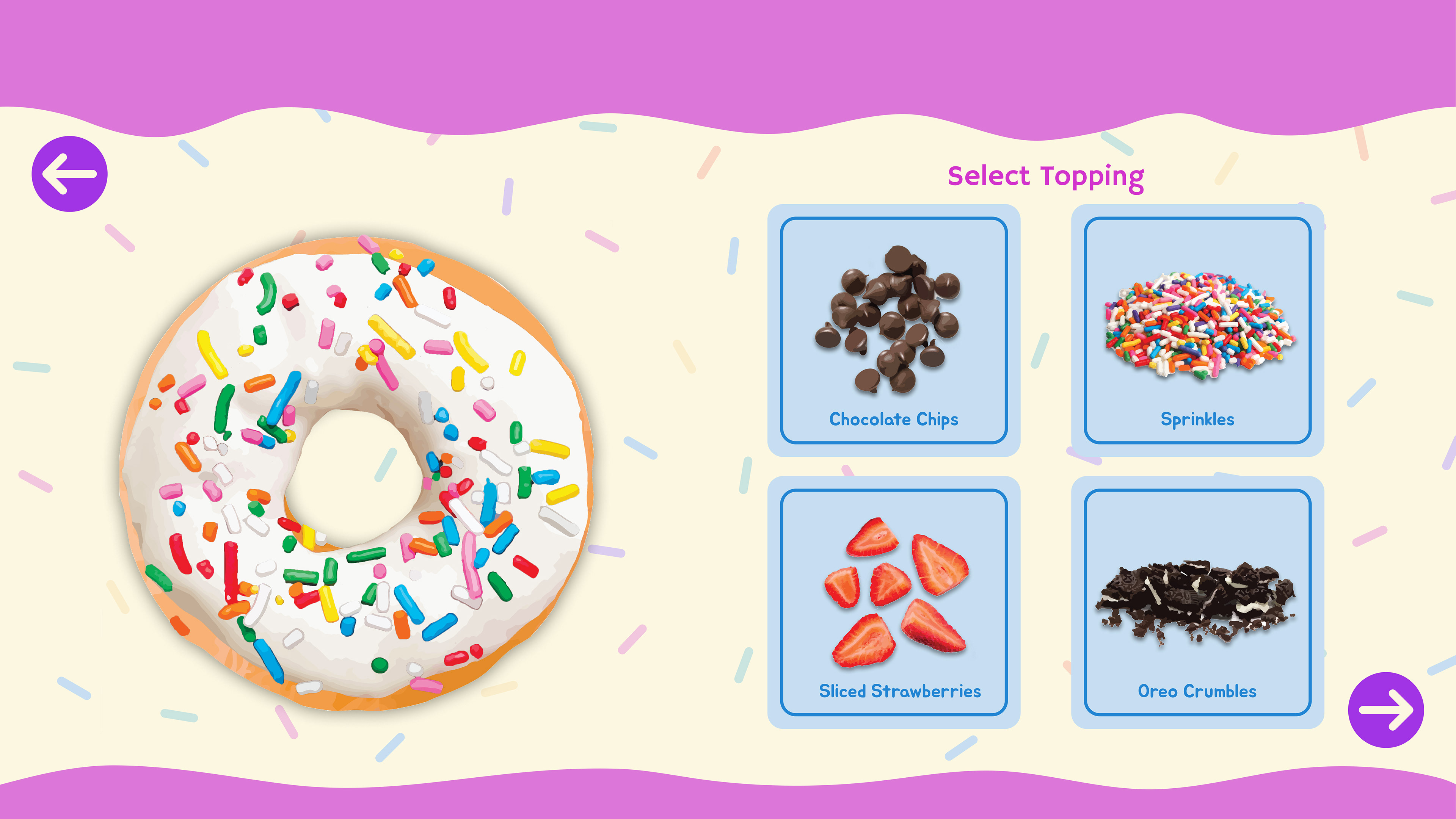
The Topping Selection screen pops up once the user selects an icing. Here, they receive a handful of topping options to choose from. Just like the icing flavors, these toppings would switch up on a monthly basis.
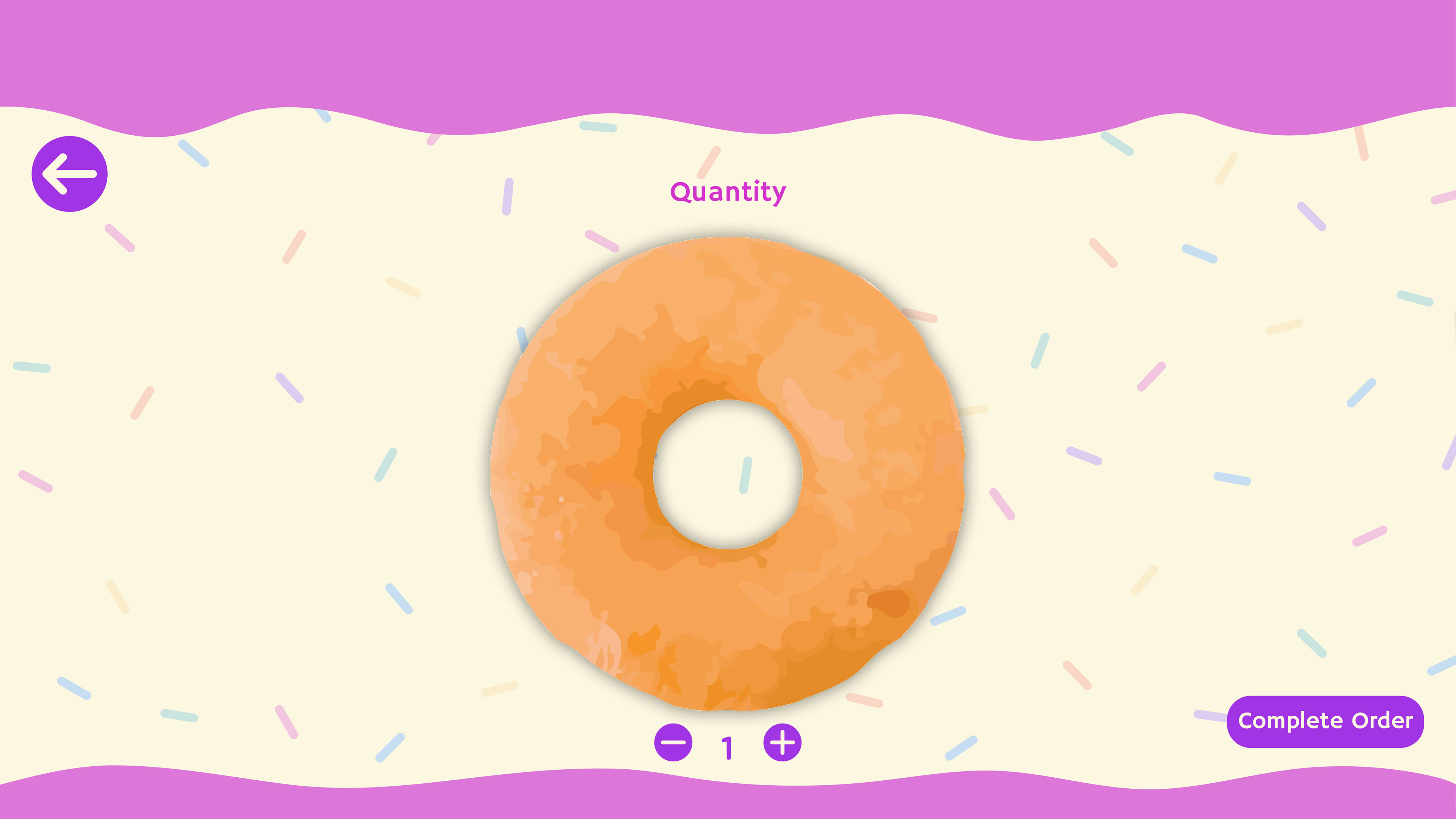
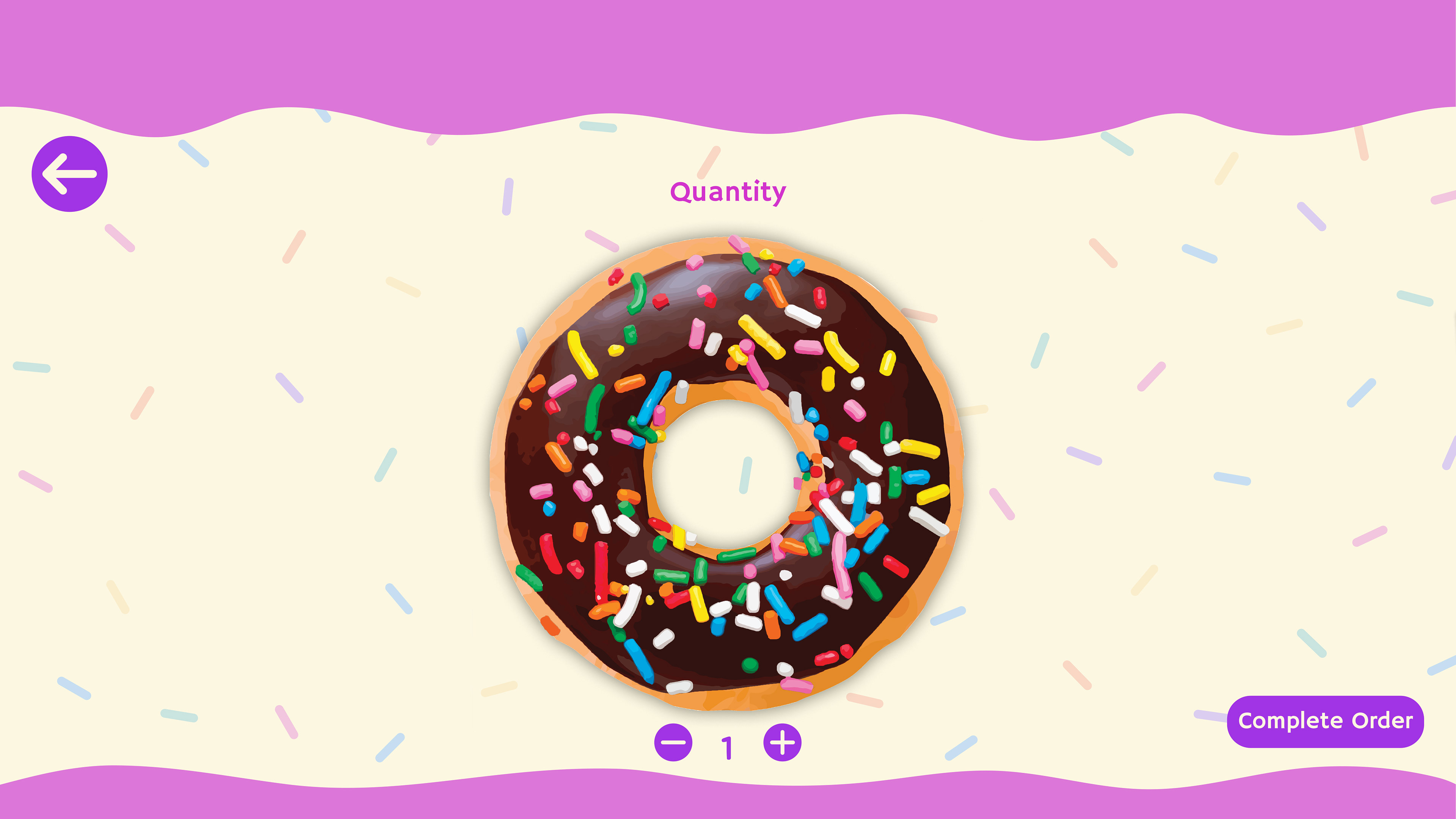
Regular Donut Quantity Screen
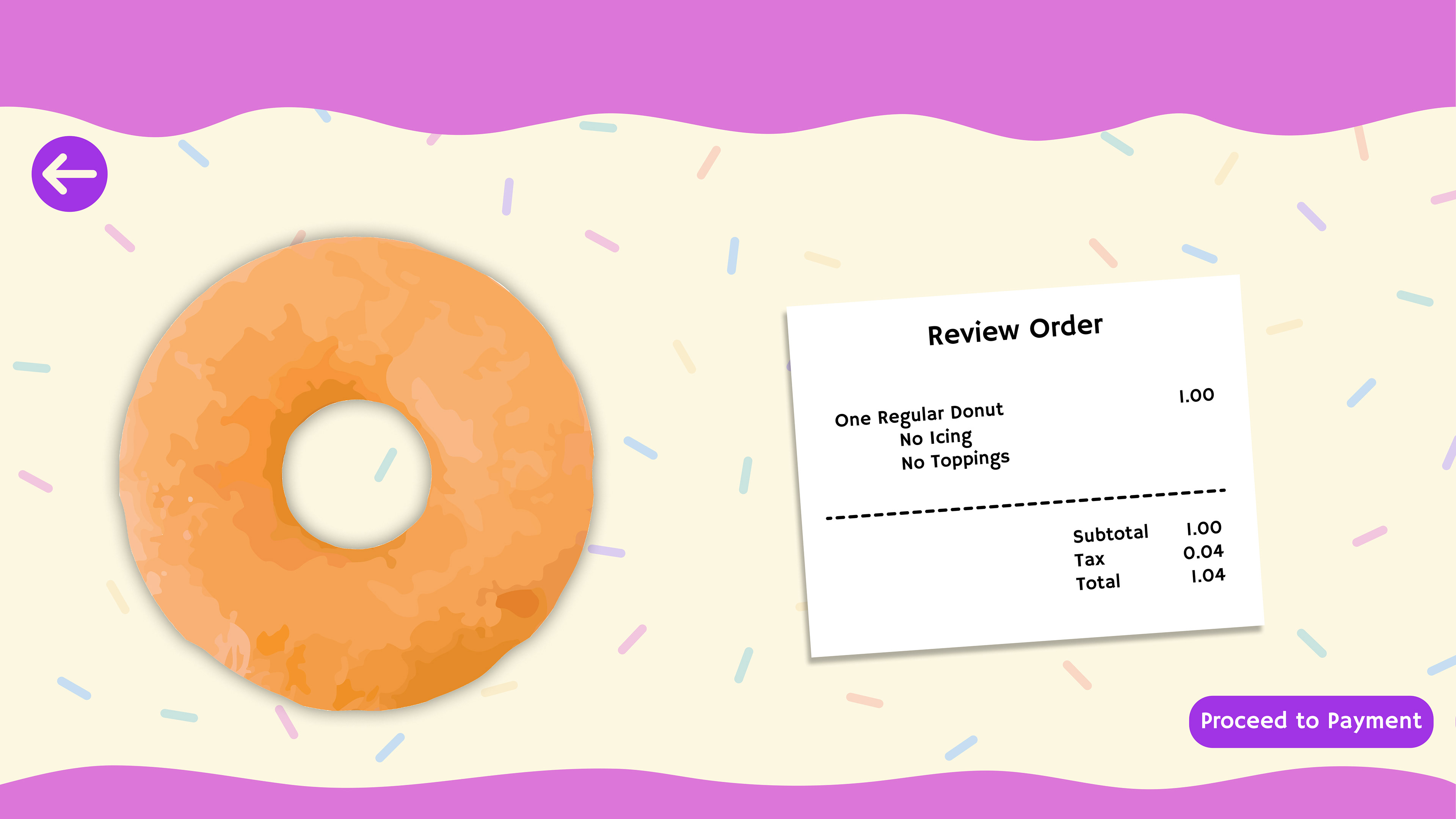
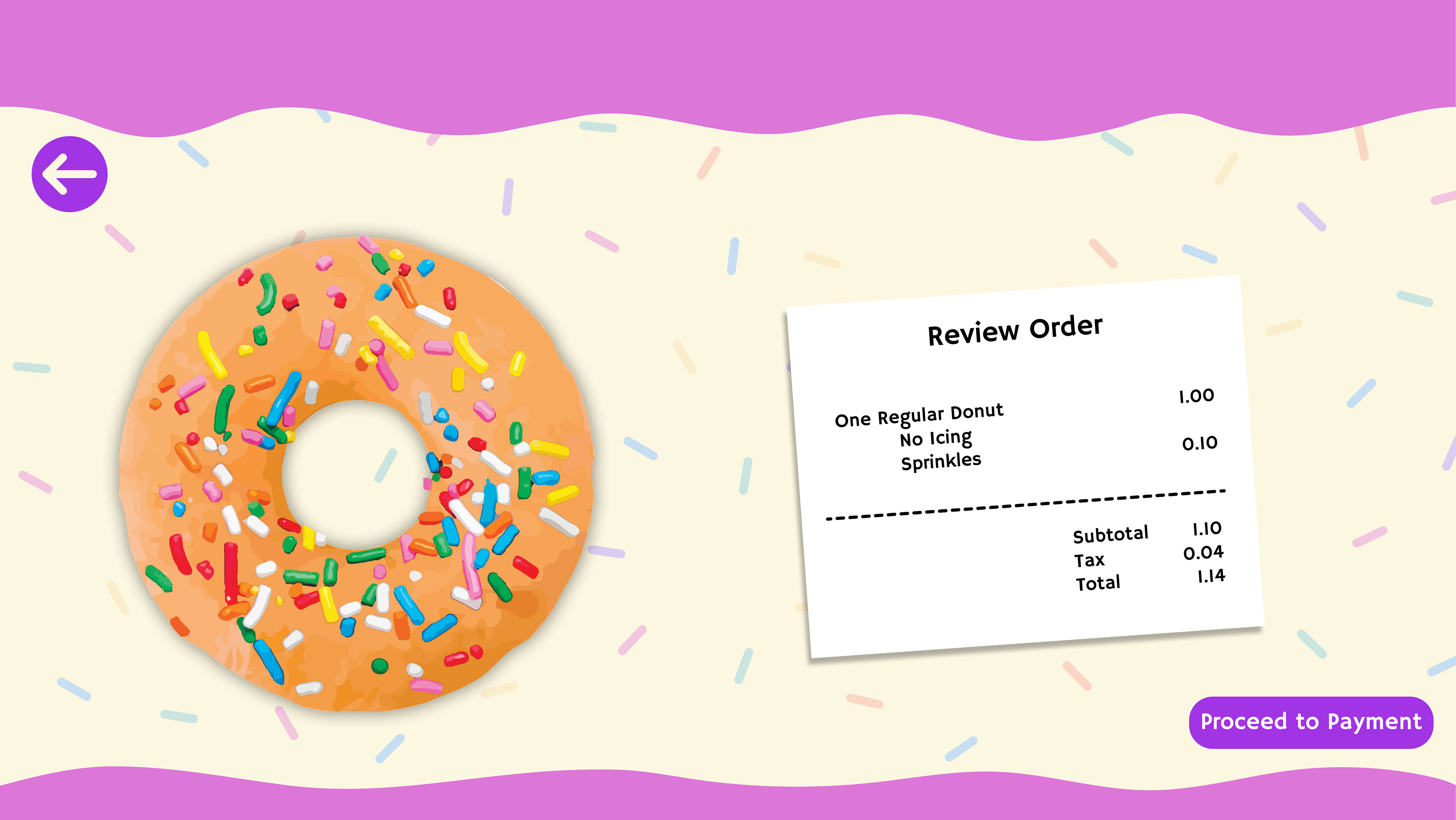
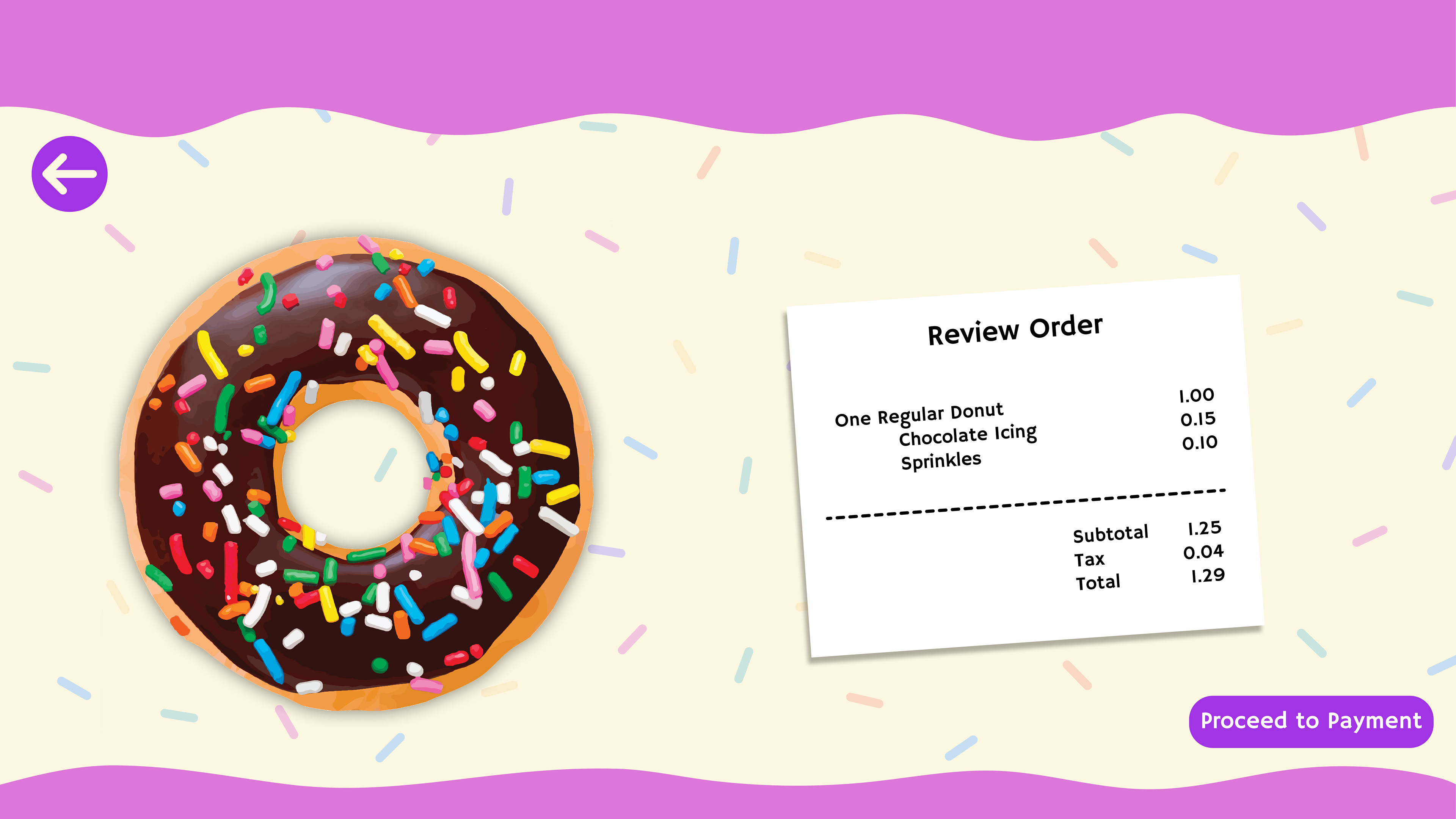
Regular Donut Review Order Screen
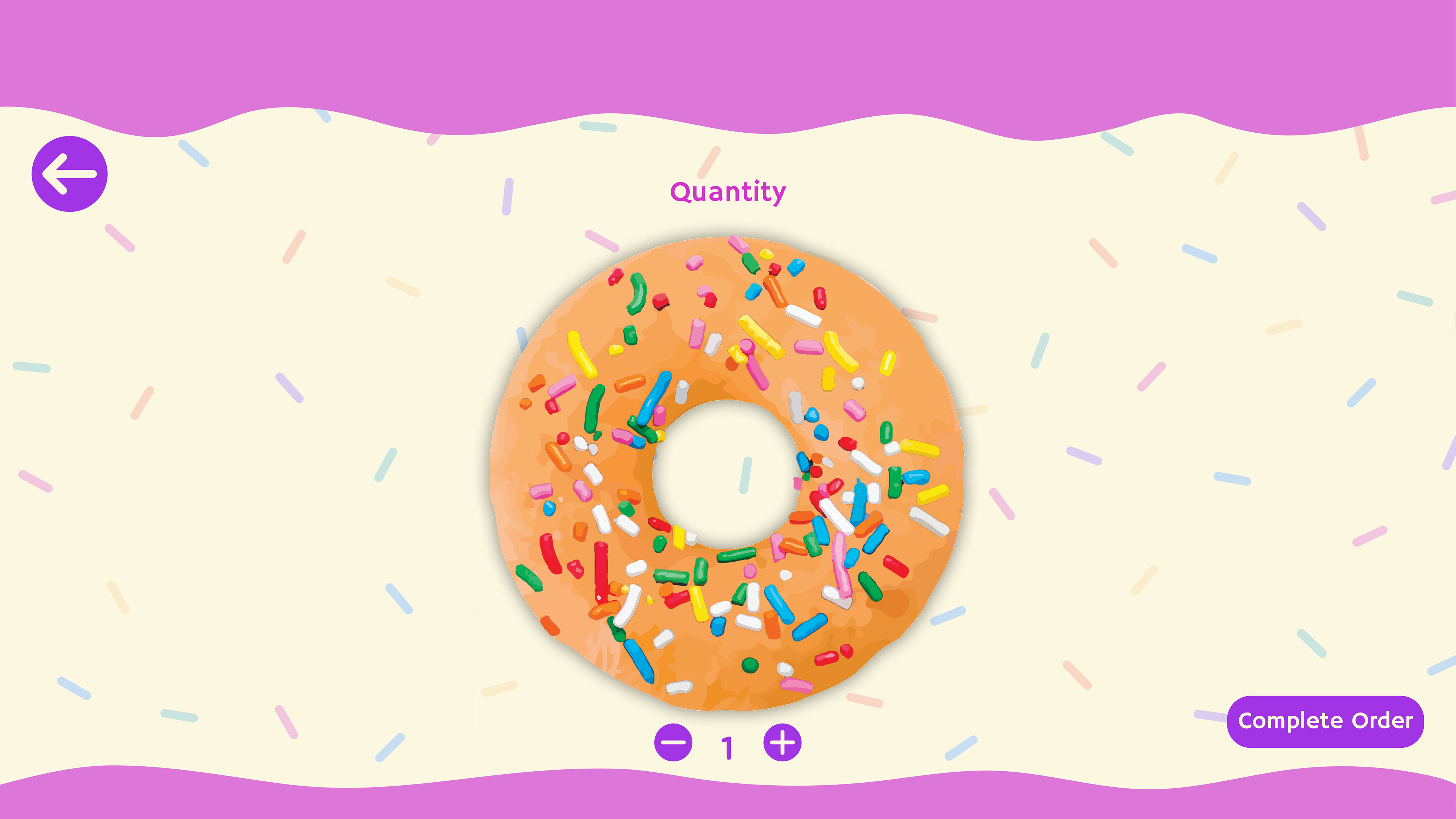
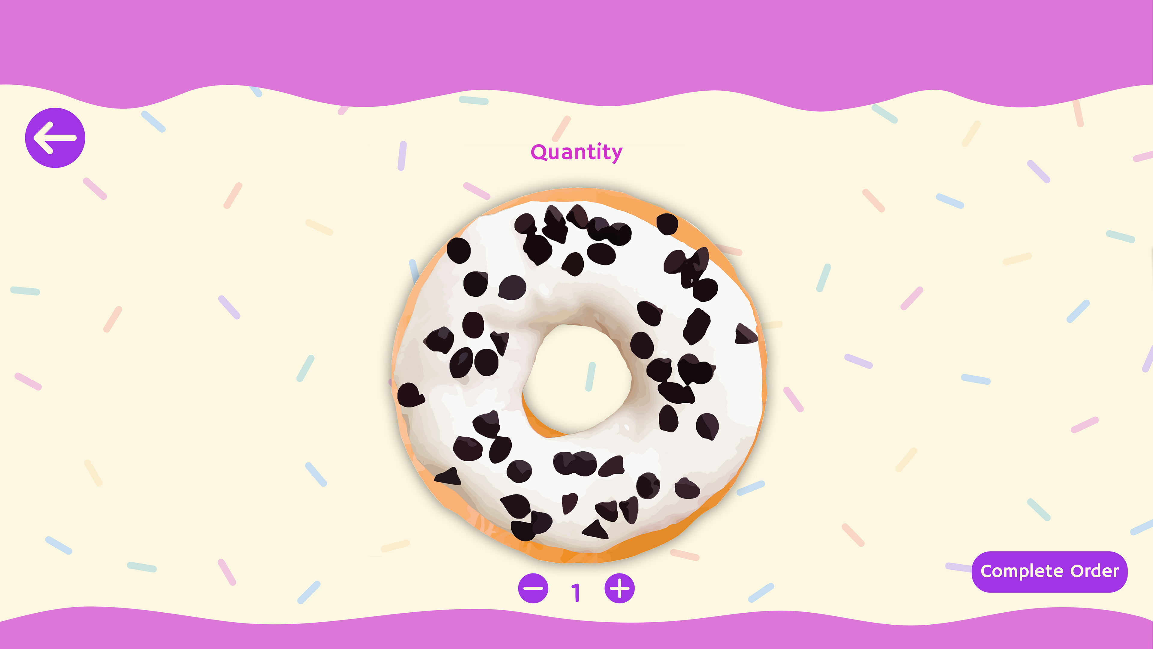
The Quantity screen allows users to choose the number of donuts they want, ranging from a single to a full dozen. Once decided, they can then proceed to the next screen to finalize their order.
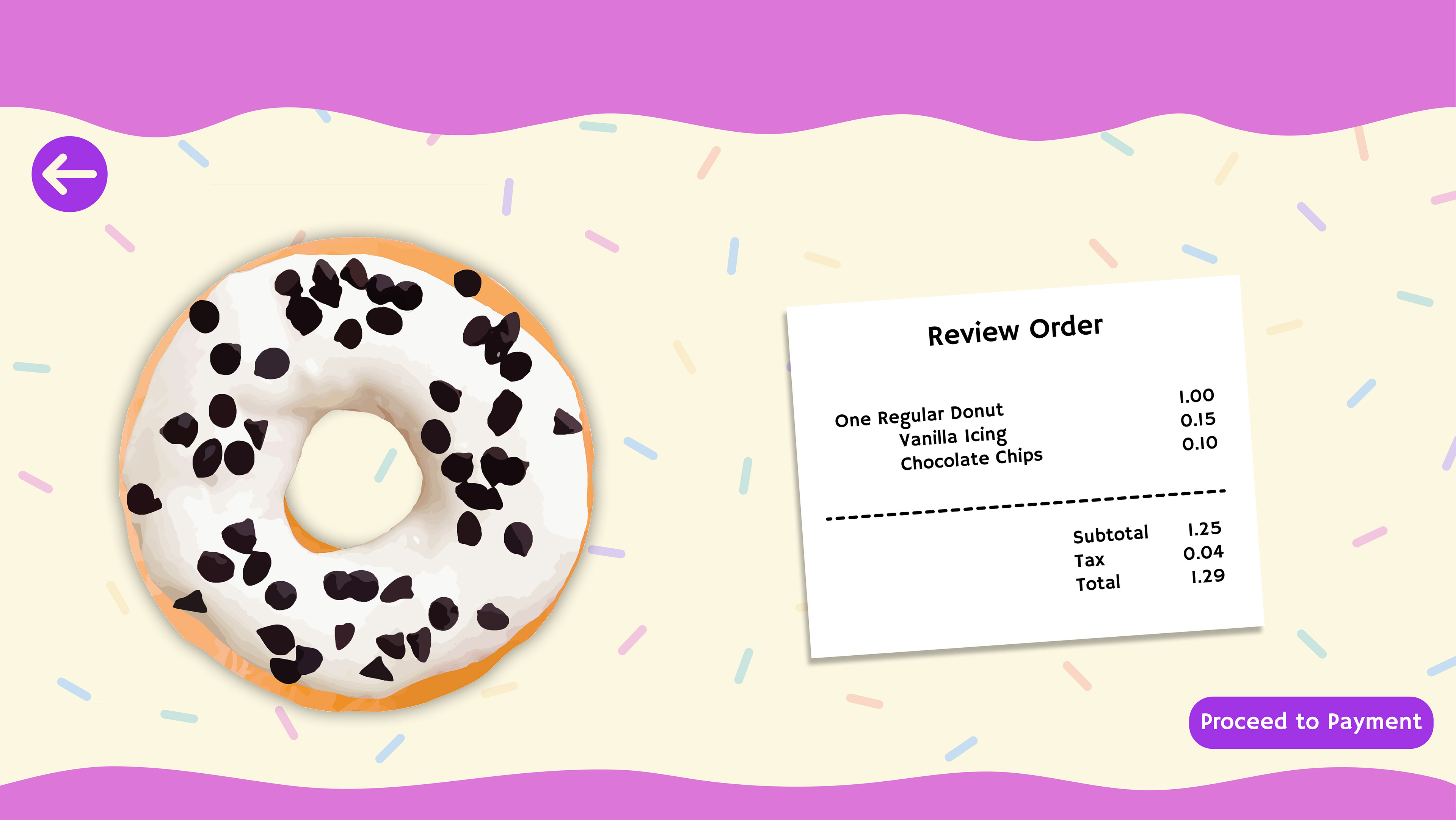
The Review Order screen provides users with an overview of their final order along with the cost. Any extras like icing and toppings incur a slight additional charge. Following this, users can proceed to the payment screen to complete their purchase.

Payment Screen
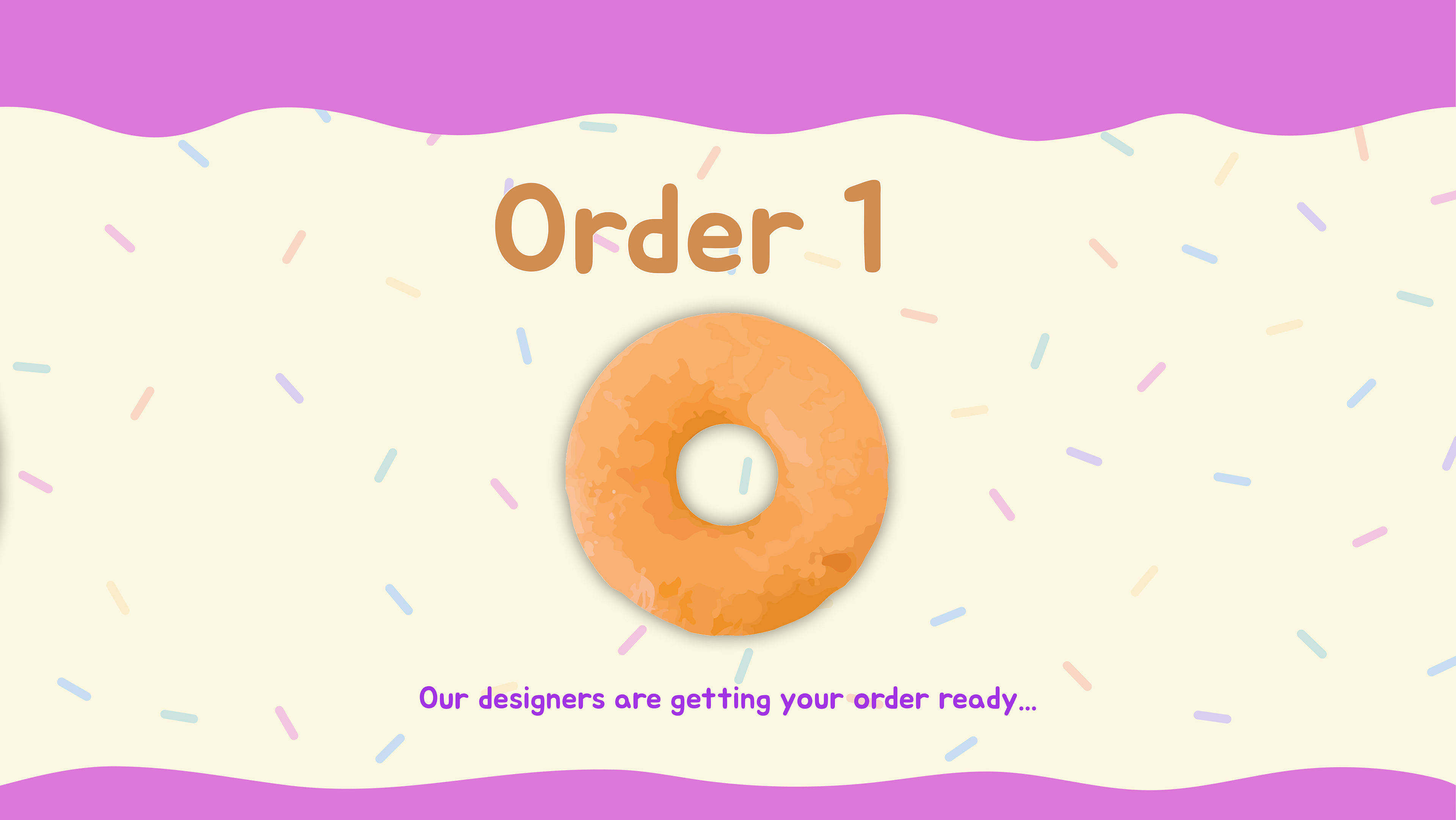
Final Order Screen
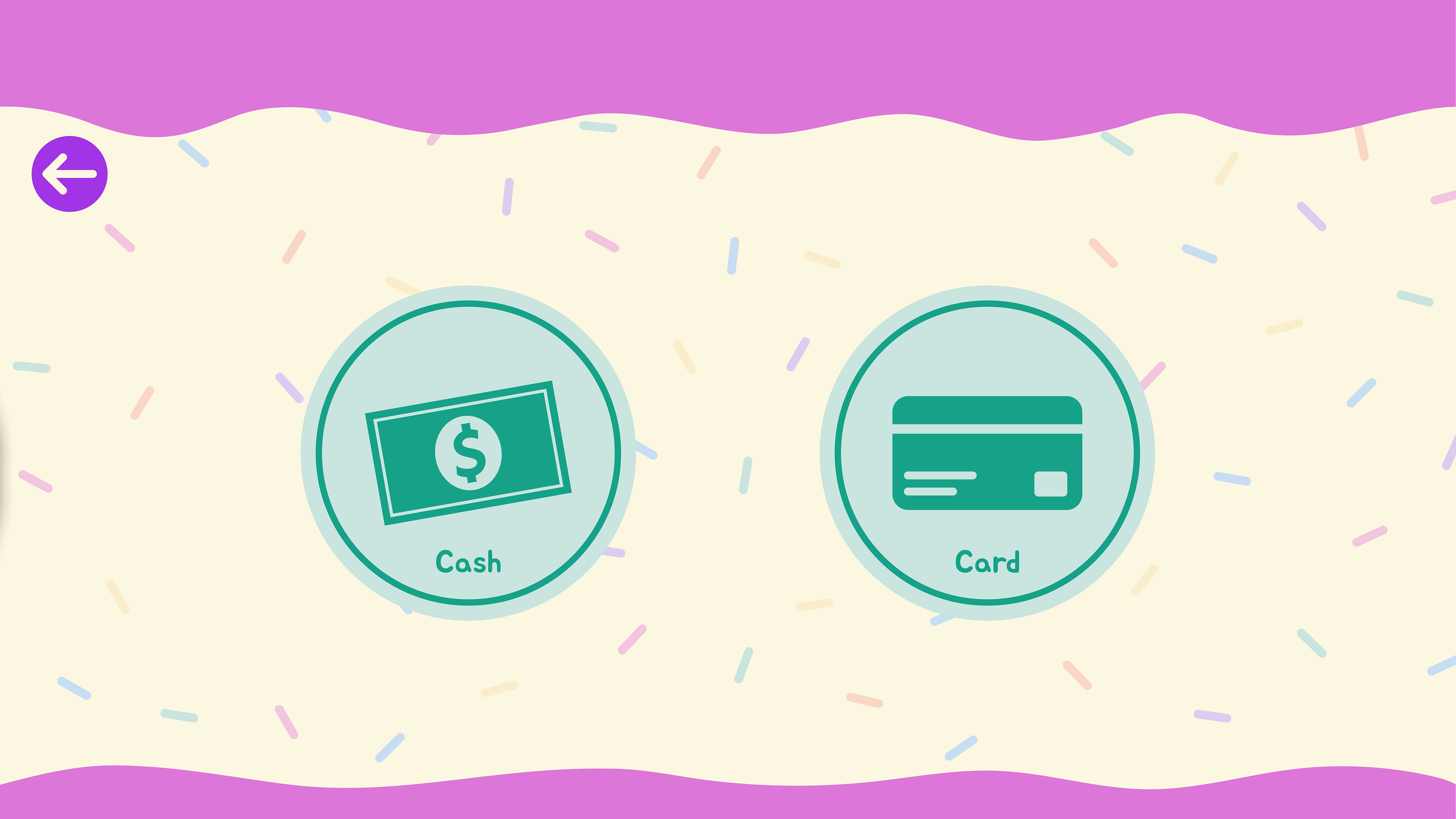
On the Payment screen, users are presented with two convenient options: Cash or Card. Opting for cash? Head over to the shop's cash register. Prefer card payment? Simply use the keypad with your card of choice.
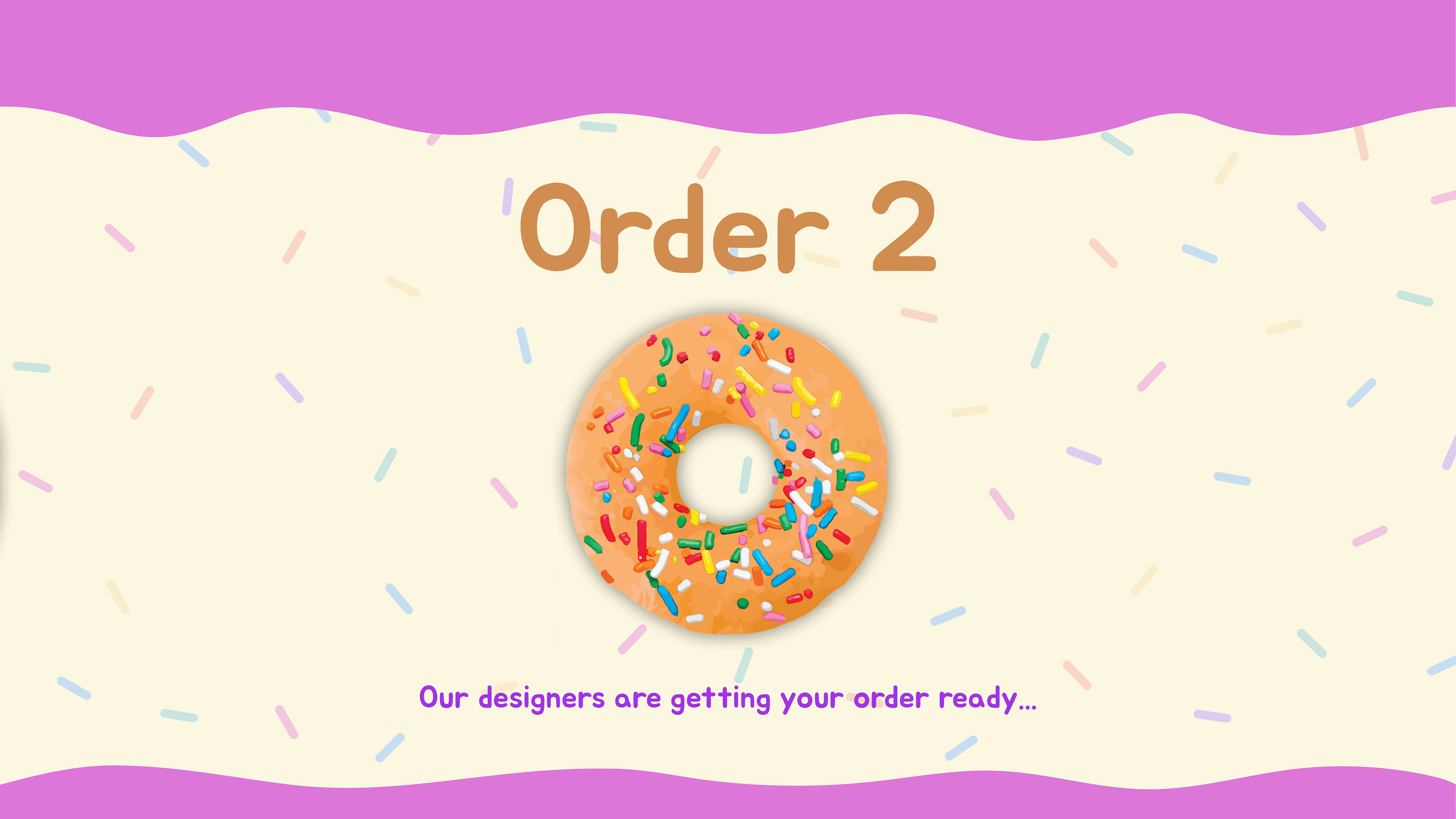
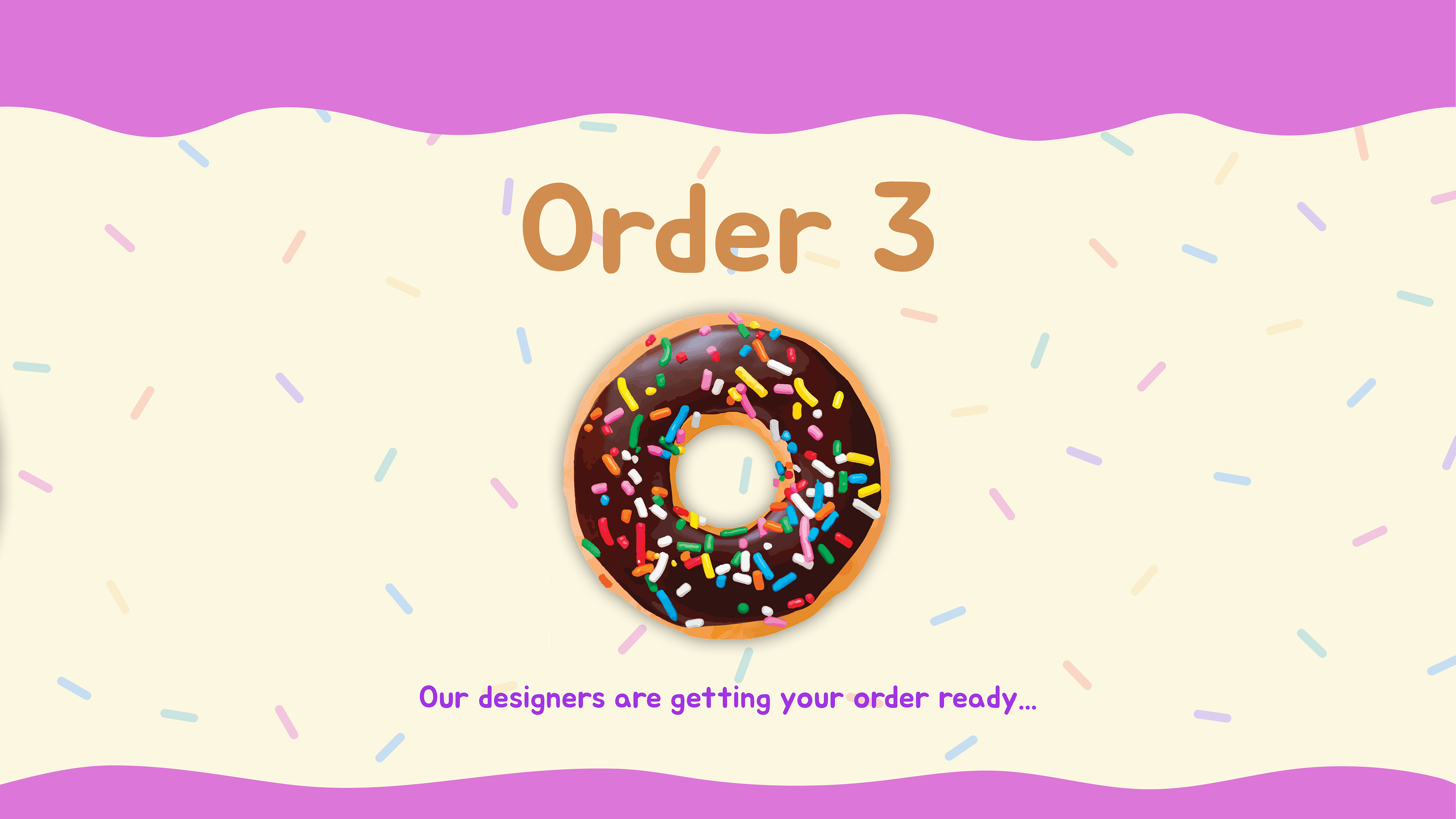
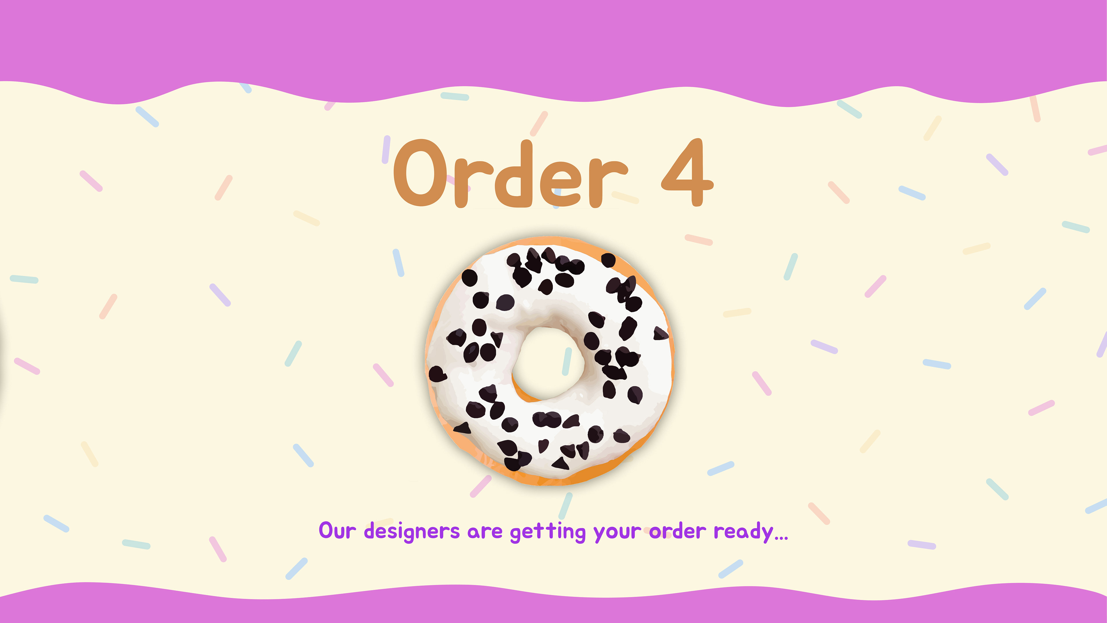
The Final Order screen displays the user's customized donut along with the order number at the top. A reassuring message, "Our designers are getting your order ready..." assures users that their request is in progress. After a moment of inactivity, the screen redirects back to the Home screen.
Wireframes
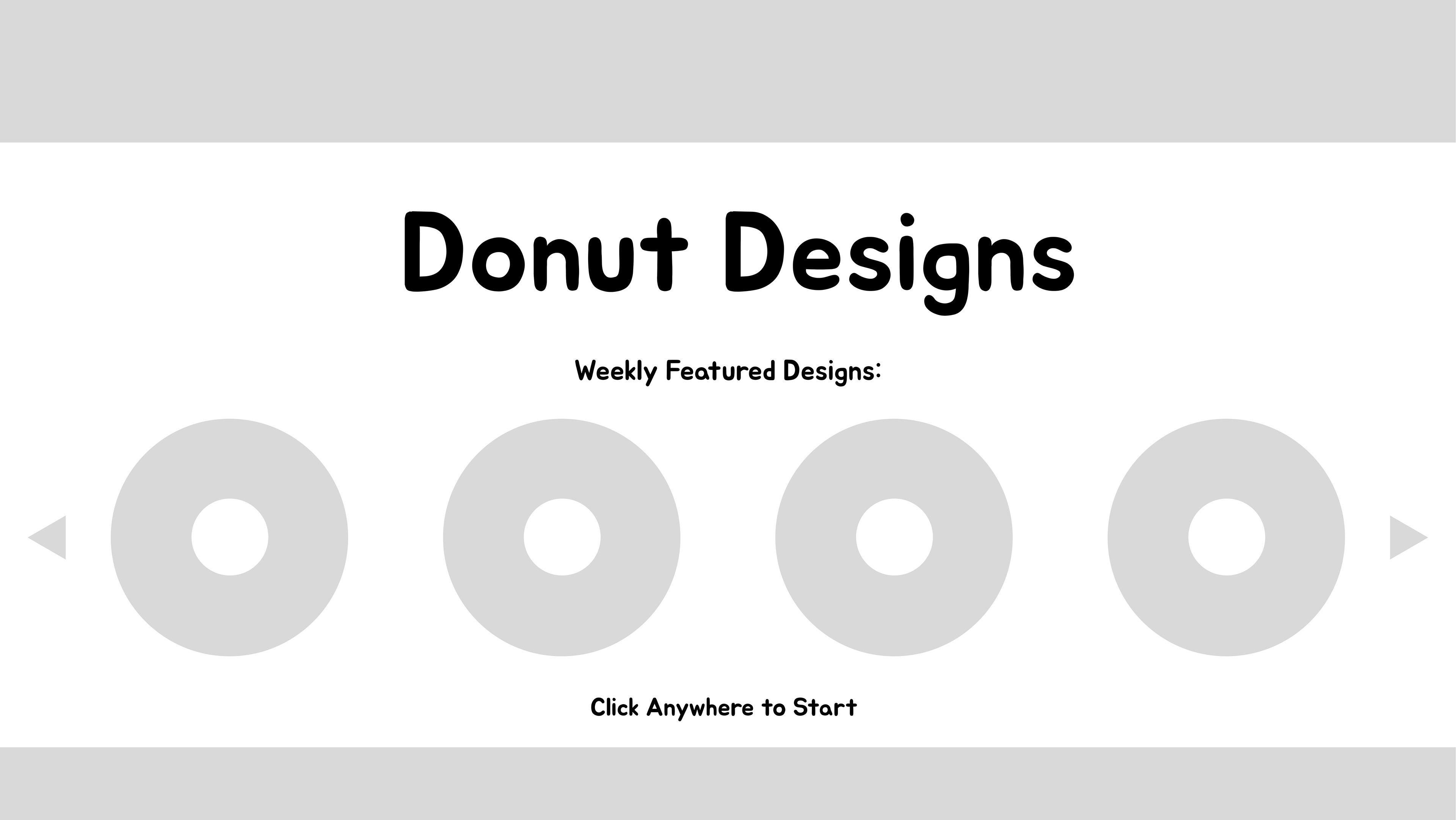
Home Screen Wireframe
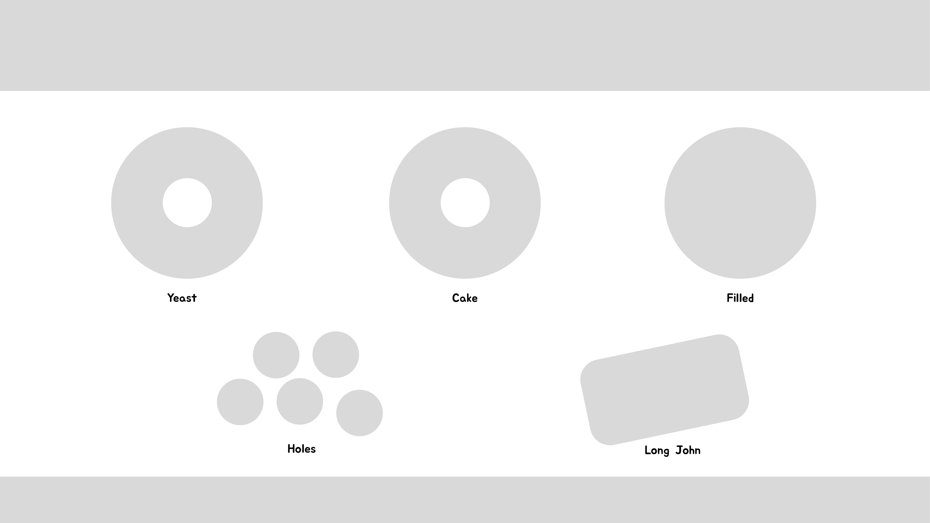
Donut Type Selection Wireframe
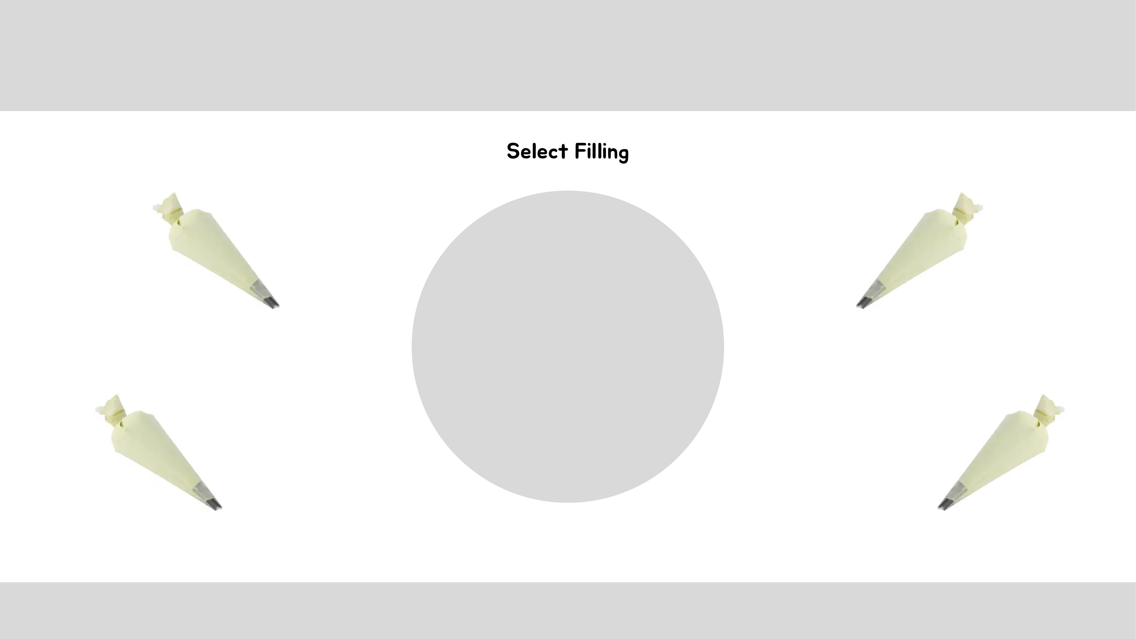
Filling Selection Wireframe
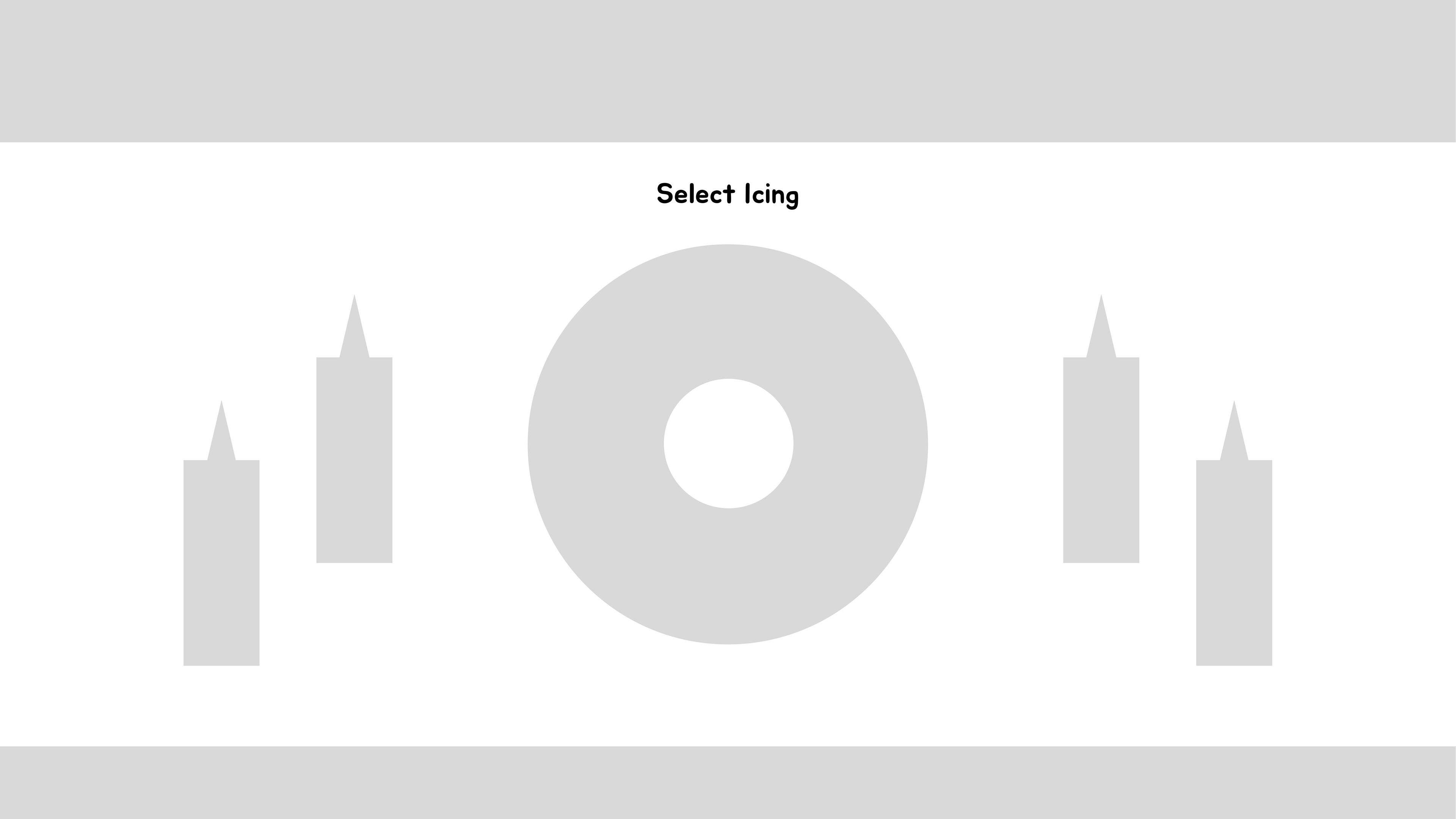
Icing Selection Wireframe
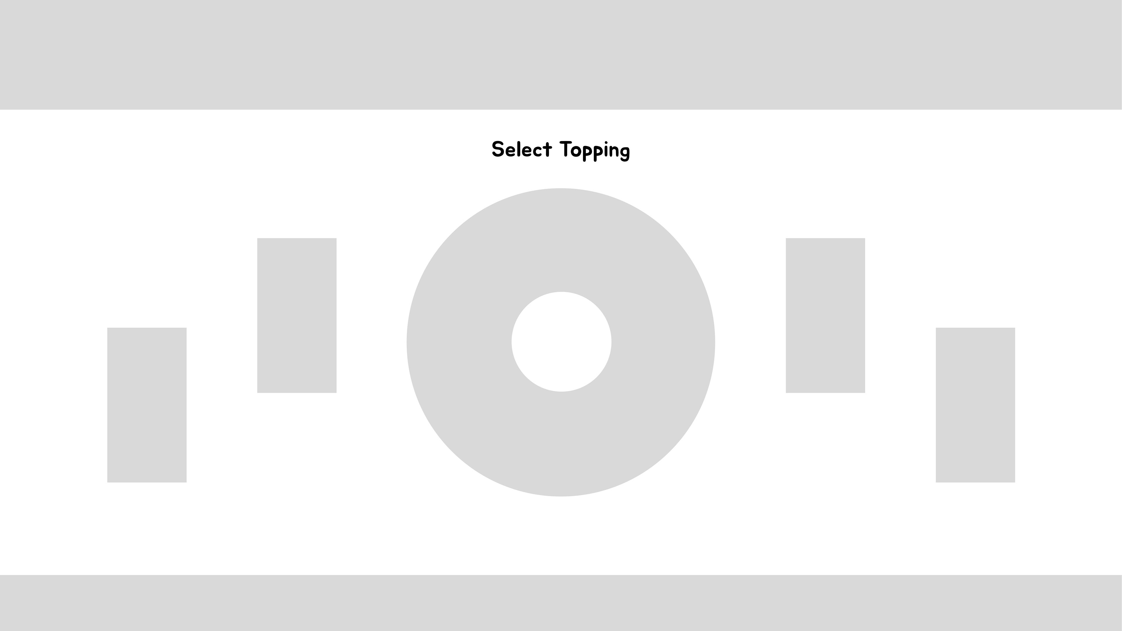
Topping Selection Wireframe
In the Wireframe stage, the original concept was to infuse a game-like element into the kiosk. Consequently, the screens were envisioned with a focus on continuous user engagement. The initial interaction involved users physically dragging a bottle of icing or a topping bottle onto their donut. This idea then evolved into its current iteration. Additionally, the decision was made to streamline the available donut types, leading to the exclusion of Cake and Long John donuts in favor of the three final options.
Kiosk Design
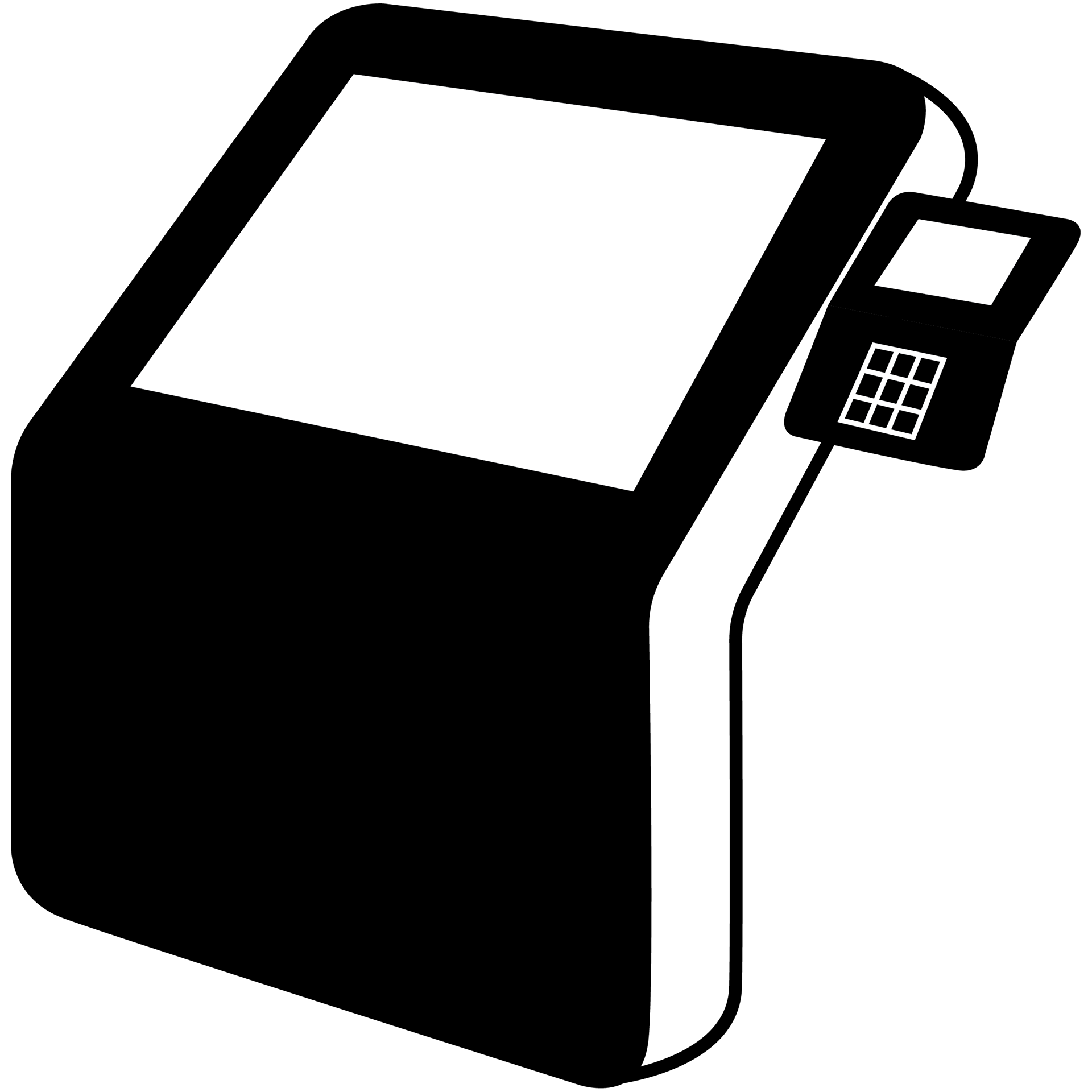
Kiosk Line Art

Kiosk In Use Line Art
The Kiosk is attached to the counter, allowing users to easily approach it upon entering the shop. It will be positioned at approximately 3.5 feet from the floor providing a convenient and accessible interface. Each shop will be equipped with two to three of these kiosks, ensuring a smooth experience for multiple visitors.
Final Designs






Conclusion
At Donut Designs, the kiosk started out as simplistic wireframes and evolved into a set of fully designed screens. Users will kick things off at the Home screen and proceed to craft their dream donut, picking out the type, icing, and toppings. The kiosk was designed with making it user-friendly every step of the way. As the kiosk developed to what it is now, lots of thought was put in to how users would want to interact with it. The kiosk won't just be a one-time thing as it was designed so that new flavors and toppings can be added or swapped out.


